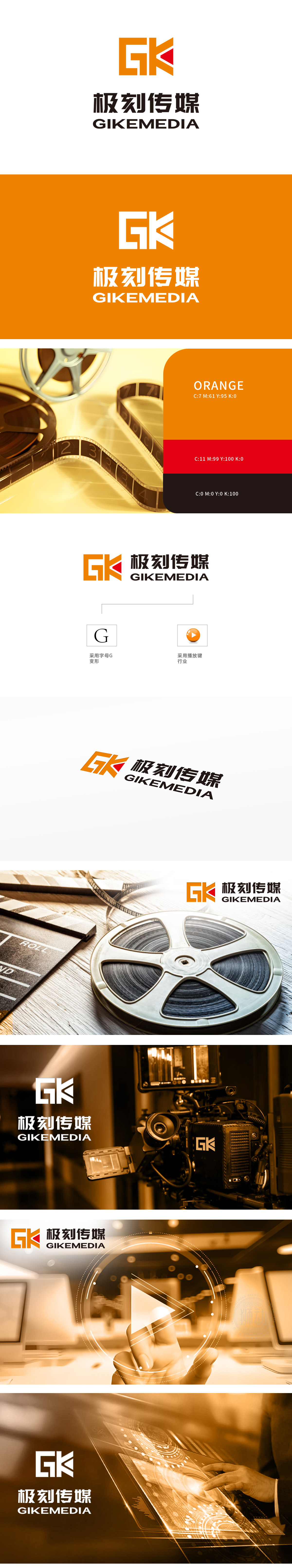
狮动设计由字母“G”和“K”组合而成,其中“G”采用变形设计,融入了播放键的元素,象征影视传媒行业的特性。橙色:活力、创新,吸引眼球。黑色:稳重、专业,提升整体质感。橙黑撞色的“GK”标志如利刃破局,直指行业核心,二者联袂构筑出“内容即行动”的品牌哲学。线条硬朗、色块分明的现代构图,既彰显传媒效率,又预留无限创意延展空间。
Lion design is composed of letters "G" and "K", in which "G" adopts deformation design and incorporates the elements of play keys, symbolizing the characteristics of film and television media industry. Orange: Energetic, innovative and eye-catching. Black: stable and professional, improving the overall texture. The "GK" symbol of orange-black contrast is like a sharp sword, pointing directly at the core of the industry, and the two together build a brand philosophy of "content is action".


扫码或拨打添加客服微信


