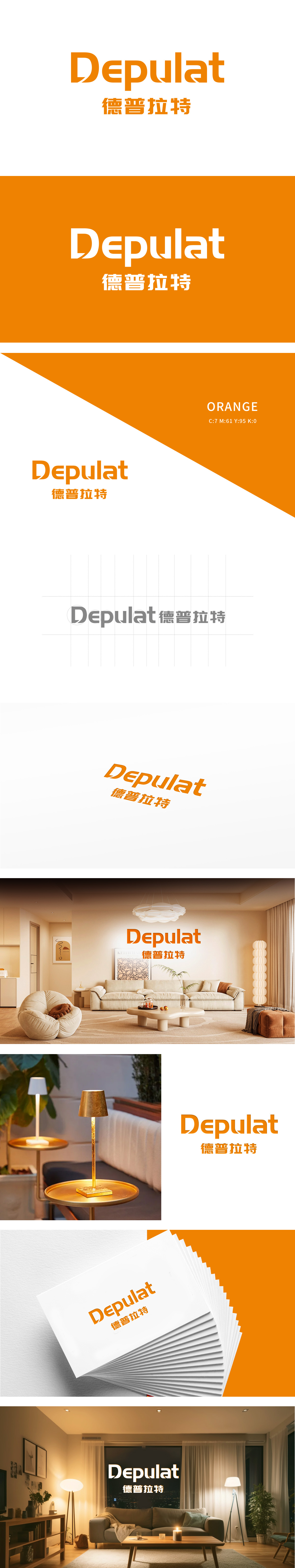
狮动设计由D”的弧形切割与“t”的尾部延伸,暗喻灯管的柔韧与光线流动,字体的立体切割与光影渐变处理,营造出灯具点亮瞬间的“光晕”效果,隐喻品牌为客户提供“点亮空间”的核心价值。橙色象征活力、创新和温暖,适合灯具品牌,能有效吸引客户注意。整体将灯具的光影美学与品牌基因深度融合,以极具张力的橙色流线型字体设计,瞬间捕获观者目光,彰显狮动设计团队对行业特性的精准洞察与创新表达。
Lion design is made up of the arc cutting of D and the extension of the tail of T, which is a metaphor for the flexibility and light flow of the lamp tube, the three-dimensional cutting of the font and the gradual treatment of light and shadow, creating the "halo" effect of the lamp at the moment of lighting, and metaphor for the core value of the brand to provide customers with "lighting space". Orange symbolizes vitality, innovation and warmth, which is suitable for lamp brands and can effectively attract customers' attention.


扫码或拨打添加客服微信


