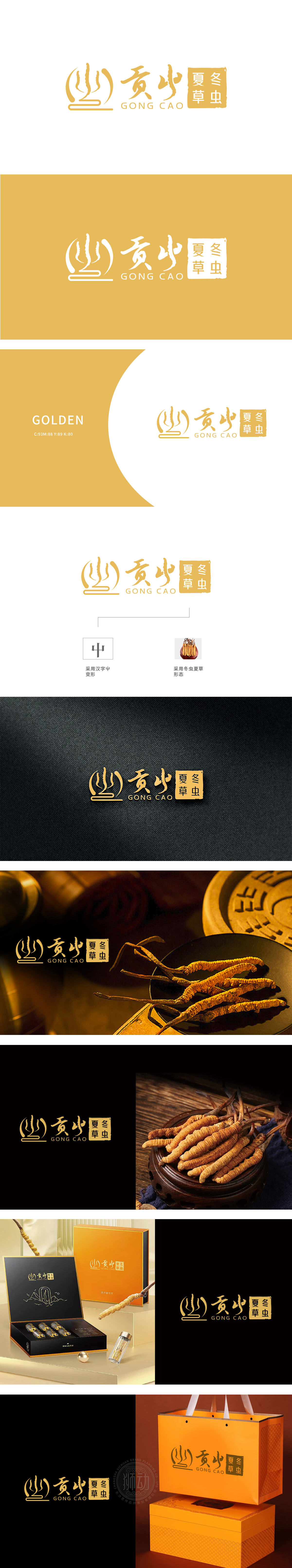
狮动设计以冬虫夏草的自然形态为原型——弯曲的虫体化作流畅线条,顶部抽象为向上舒展的「草叶」,三笔渐变勾勒出虫草破土而生的生命力,巧妙避开具象化的生硬感,传递「天然珍稀」的产品属性。「意」的文化深植:融入汉字「屮」(chè,古汉字中「草」的本字)的变形结构,三竖象征「天、地、人」三才,与下方横线条组成稳定基座,既呼应虫草「阴阳共生」的中医哲学,又暗合「贡草」品牌高端、正统的定位,传统文化底蕴跃然纸上。采用鎏金渐变色,既还原虫草的自然色泽,又赋予「尊贵、滋补」的联想,打破传统中药材LOGO的沉闷感,让品牌故事「长」在视觉里。
Lion design takes the natural form of Cordyceps sinensis as the prototype-the curved insect body turns into a smooth line, and the top fungus base is abstracted as a "blade of grass" stretching upwards. Three gradual changes outline the vitality of Cordyceps sinensis, cleverly avoiding the figurative stiffness and conveying the product attributes of "natural rarity". The culture of "Yi" is deeply rooted: it is integrated into the deformed structure of the Chinese character "Qi" (chè, the original word of "grass" in ancient Chinese characters), and the three vertical symbols of "heaven, earth and man" form a stable base with the horizontal lines below.


扫码或拨打添加客服微信


