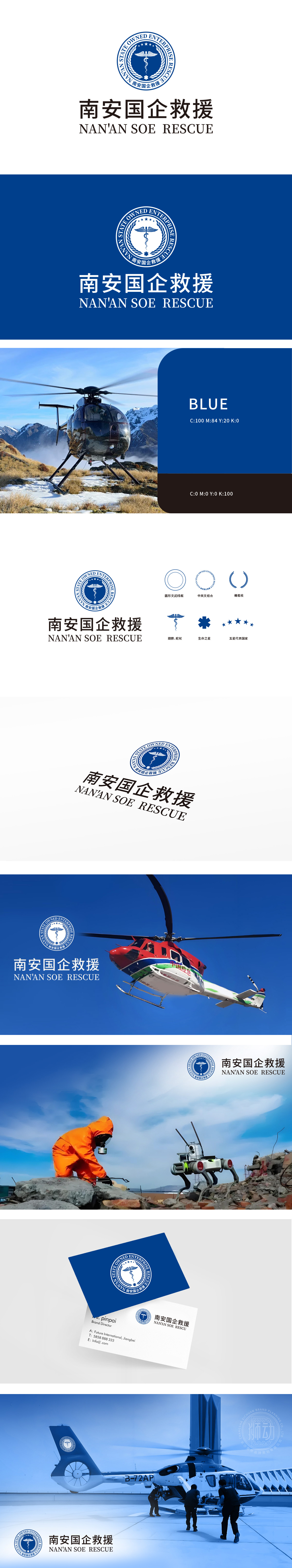
狮动为南安国企救援设计的品牌logo,以蓝色为主色调传递专业信赖,白色线条勾勒出翅膀与蛇杖的经典救援符号,融合力量感与速度感。我们将“南安国企”的中英文名称与徽章造型创新结合,在有限空间内实现品牌属性、行业特征与美学价值的完美平衡。该设计既凸显国企责任担当,又以现代视觉语言提升辨识度,成为救援领域品牌建设的标杆之作
Case study: The brand logo designed by Lion Motion for the rescue of state-owned enterprises in Nan 'an conveys professional trust with blue as the main color, and the white lines outline the classic rescue symbols of wings and snake sticks, combining the sense of strength and speed. We combine the Chinese and English names of "Nan 'an State-owned Enterprise" with badge modeling innovation to achieve a perfect balance of brand attributes, industry characteristics and aesthetic value in a limited space.


扫码或拨打添加客服微信


