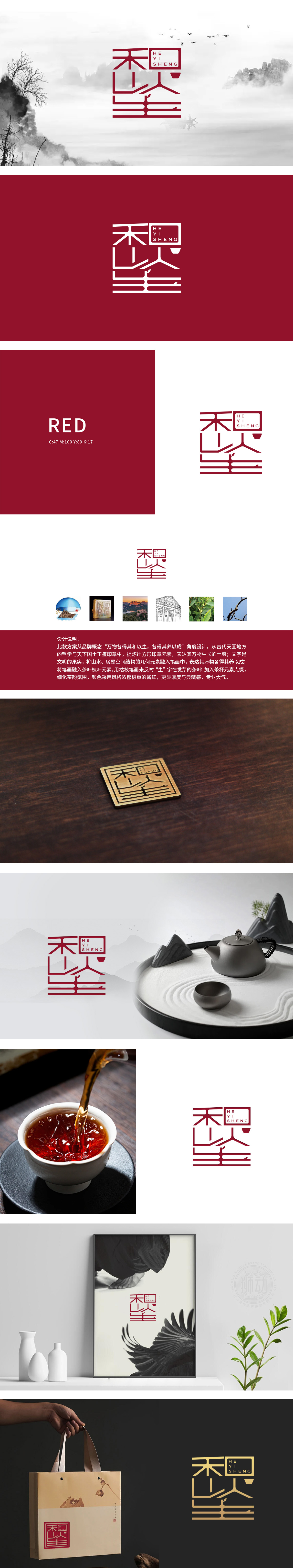
狮动设计以方形玉玺印章为轮廓,暗合“天下国土”的包容气度,象征品牌如土壤般滋养万物的根基,红色印章自带庄重典藏感,一眼奠定高端调性。笔墨融茶·枯荣相生:“和生”二字暗藏玄机:「生」字笔画化身为新发的茶芽,灵动向上;旁侧枯笔枝条与之呼应,以“枯荣对比”诠释“生生不息”,细节处可见茶叶脉络的自然肌理,仿佛指尖能触到茶毫的柔软。山水入字·气韵流动:文字笔画中融入山水轮廓与建筑飞檐的几何线条——横如远山含黛,竖似房梁挺括,让静态的LOGO生出“人在草木间”的悠远意境,恰如茶禅一味的东方哲学。方寸之间,藏尽茶语万象。
Lion design takes the square seal as the outline, which coincides with the tolerance of "the land of the world", symbolizing that the brand nourishes the foundation of everything like soil. The red seal has its own solemn sense of collection, laying a high-end tonality at a glance.Brush and ink melt tea, wither and flourish together: the word "harmony and health" has a hidden mystery: the strokes of "health" are transformed into new tea buds, which are smart and upward; The dead branches on the side echo it, interpreting "endless life" with "contrast between withering and glory", and the natural texture of tea veins can be seen in the details, as if the fingertips can touch the softness of tea.


扫码或拨打添加客服微信


