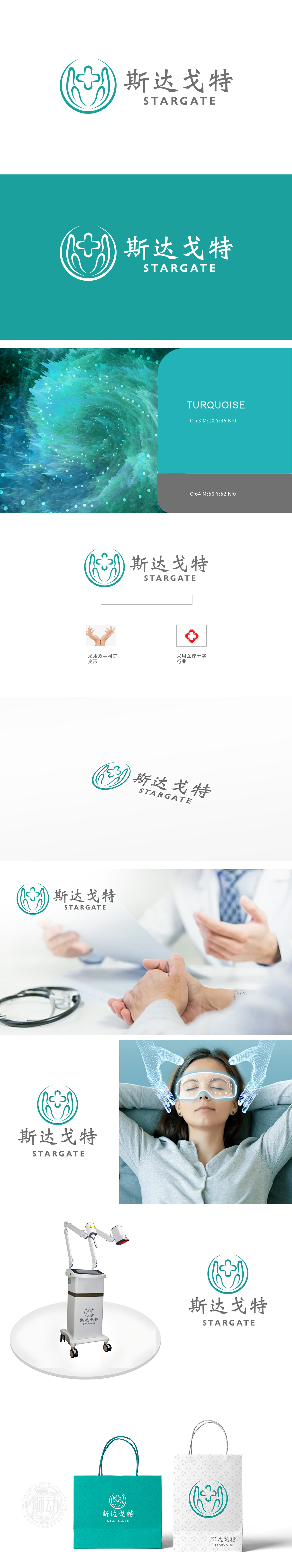
狮动设计融入了医疗行业的标志性符号——医疗十字(红十字),明确标识了该公司的行业属性为医疗领域。医疗十字的使用强化了专业性和信任感。采用双手呵护的变形设计,象征着关怀、保护与支持。传递出温暖与安全的感觉。绿色常与健康、生命相关联,传达出自然、安全和健康的印象;灰色则显得稳重、专业,整体配色方案符合医疗行业的专业性和可靠性要求。品牌以专业能力为基石,为患者提供全方位的健康守护。十字的简洁几何形态与双手的柔美曲线形成对比,平衡了温暖与严谨的品牌调性。
Lion design incorporates the medical cross (Red Cross), the iconic symbol of the medical industry, which clearly identifies the company's industry attribute as the medical field. The use of medical cross strengthens professionalism and trust. The deformed design with hands care symbolizes care, protection and support. Convey a feeling of warmth and security. Green is often associated with health and life, conveying the impression of nature, safety and health; Gray is stable and professional, and the overall color scheme meets the professional and reliability requirements of the medical industry.


扫码或拨打添加客服微信


