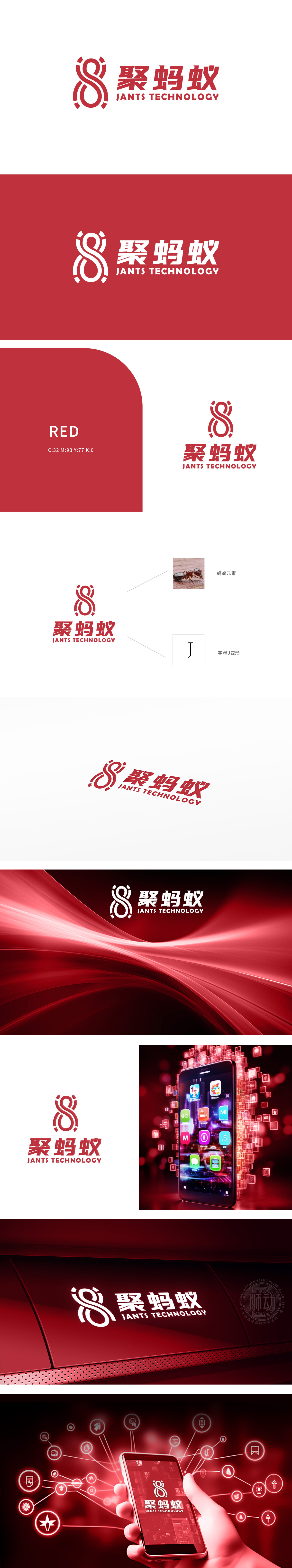
狮动设计巧妙地融入了字母“J”的变形设计,同时既有具象的蚂蚁形象,勤劳、团结和高效。寓意着团队协作和不懈努力的精神。红色为主色调,红色通常象征着热情、活力和创新,符合科技公司的形象定位。红色也能在视觉上迅速抓住观众的注意力,提升品牌的醒目度。将自然元素(如蚂蚁)与现代科技(如字母变形)结合,体现了公司致力于科技创新的同时,注重自然和谐与可持续发展的理念。
Lion design skillfully incorporates the deformation design of the letter "J", and at the same time, it has a concrete ant image, hard work, unity and efficiency. It implies the spirit of teamwork and unremitting efforts. Red is the main color, which usually symbolizes enthusiasm, vitality and innovation, which is in line with the image positioning of technology companies. Red can also quickly catch the attention of the audience visually and enhance the brand's eye-catching. harmony and sustainable development.


扫码或拨打添加客服微信


