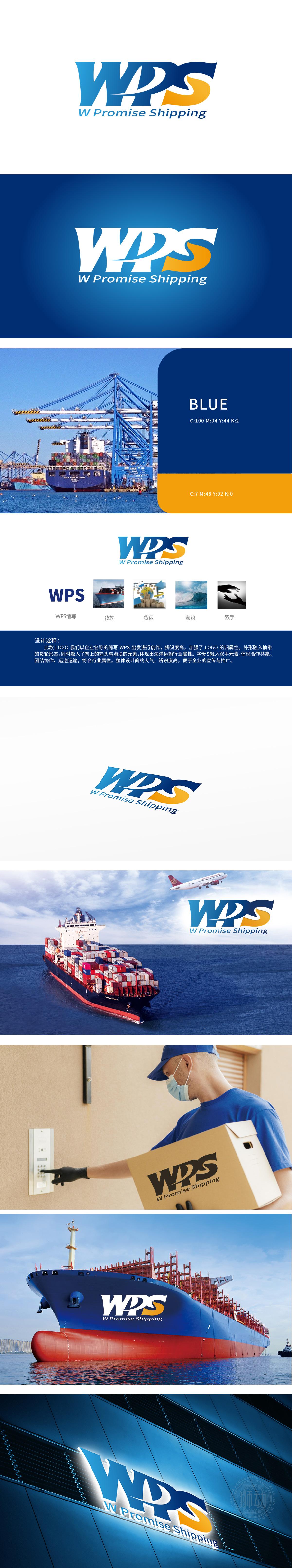
狮动设计以企业名称“WPS”为核心,将海洋运输的磅礴气势与物流行业的动态美感融为一体。字母“W”以货轮剪影勾勒,象征强大的航运能力;“S”化作托举箭头的双手,寓意合作共赢与精准配送;海浪元素贯穿整体,既展现航运挑战,又暗喻物流的连贯与韧性。通过简洁的蓝橙撞色与几何造型,不仅强化品牌记忆点,更传递出“承诺必达”的行业使命。
Lion design takes the enterprise name "WPS" as the core, and integrates the majestic momentum of ocean transportation with the dynamic beauty of logistics industry. The letter "W" is outlined by the silhouette of a cargo ship, symbolizing strong shipping capacity; "S" turns into hands holding up arrows, meaning win-win cooperation and accurate delivery; The wave element runs through the whole, which not only shows the shipping challenge, but also implies the coherence and resilience of logistics. Through the simple blue-orange contrast and geometric modeling.


扫码或拨打添加客服微信


