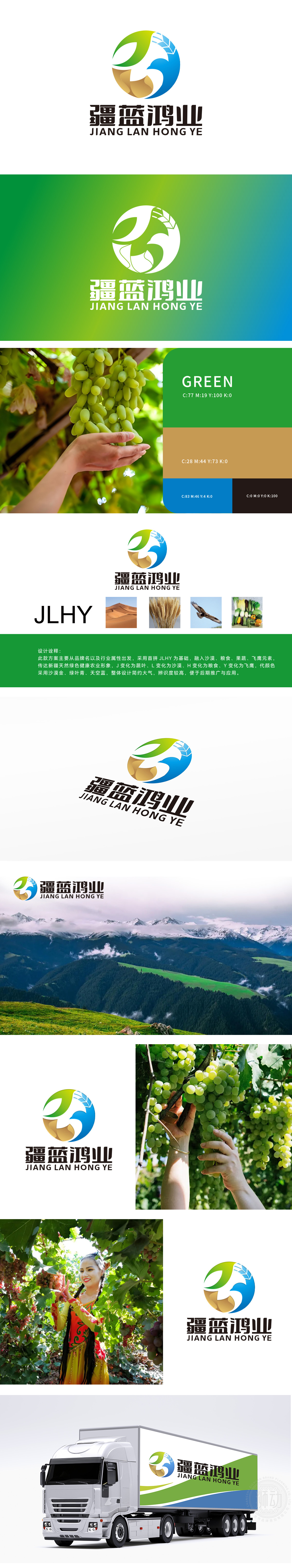
狮动设计采用公司名称的首字母“JLHY”为基础进行设计。J”——绿色蔬菜叶:象征天然健康,呼应绿色农业理念,叶片纹理细节增强真实感。“L”——金色沙漠曲线:以流线型沙丘形态展现新疆地貌,传递地域文化与资源优势。“H”——麦穗与果蔬:麦穗象征丰收与粮食安全,果蔬元素强化产品多样性,双重意象夯实产业根基。“Y”——展翅飞鹰:蓝色鹰翼象征企业腾飞与创新突破,动态姿态注入活力与未来感。金色沙漠曲线勾勒出新疆地域特色,绿色蔬菜叶与蓝色飞鹰的动态组合,传递出蓬勃生机与广阔视野,整体色调对比鲜明,瞬间抓住眼球,彰显品牌力量。
Lion design is based on the initials "JLHY" of the company name. J "-green vegetable leaves: symbolizing natural health, echoing the concept of green agriculture, and the details of leaf texture enhance the sense of reality. "L"-golden desert curve: show the landform of Xinjiang in the form of streamlined sand dunes and convey the advantages of regional culture and resources. "H"-ears of wheat and fruits and vegetables: ears of wheat symbolize bumper harvest and food security, elements of fruits and vegetables strengthen product diversity, and dual images lay a solid industrial foundation. "Y"-Flying Eagle: The blue eagle wing symbolizes the enterprise's take-off and innovation breakthrough, and the dynamic posture injects vitality and futuristic feeling.


扫码或拨打添加客服微信


