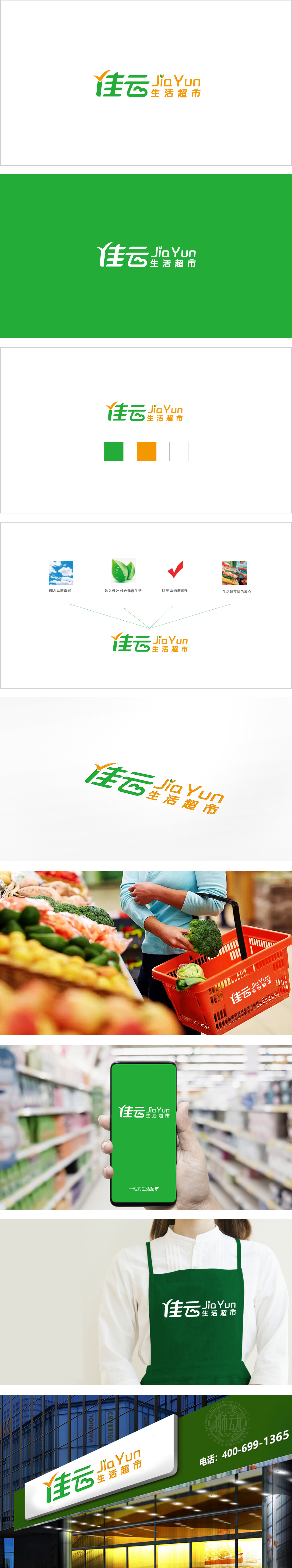
狮动设计采用「对勾+翅膀」的组合设计,「对勾」是「正确/选择」符号,暗示「选择佳云生活超市是明智之选」,直接传递品牌信任感;对勾的末端延伸出「翅膀」造型,既像飞鸟的翅膀,又像云朵的轮廓(呼应「云」字),隐喻「便捷、快速」。绿色:象征「新鲜、健康、自然」,传递「佳云的商品更新鲜」的认知;同时,绿色也是「信任色」,符合社区超市「靠谱、稳定」的形象。橙色:给人「温暖、活力、亲和力」的感觉,情感层面:绿色的「新鲜」+橙色的「温暖」,共同传递「佳云是社区里的「生活伙伴」」的情感,让消费者联想到「日常所需都能在这里满足」的安全感。功能与情感的「双重输出」(便捷+温暖),让品牌既有「实用性」又有「温度感」。
Lion design adopts the combination design of "tick+wings", and "tick" is the symbol of "right/choice", which implies that "choosing Jiayun lifestyle supermarket is a wise choice" and directly conveys brand trust; The shape of "wings" extends from the end of the hook, which is like the wings of a bird and the outline of a cloud (echoing the word "cloud"), implying "convenience and quickness". Green symbolizes "freshness, health and nature" and conveys the cognition that "Jiayun's goods are fresher"; At the same time, green is also a "trust color", which is in line with the image of community supermarkets as "reliable and stable".


扫码或拨打添加客服微信


