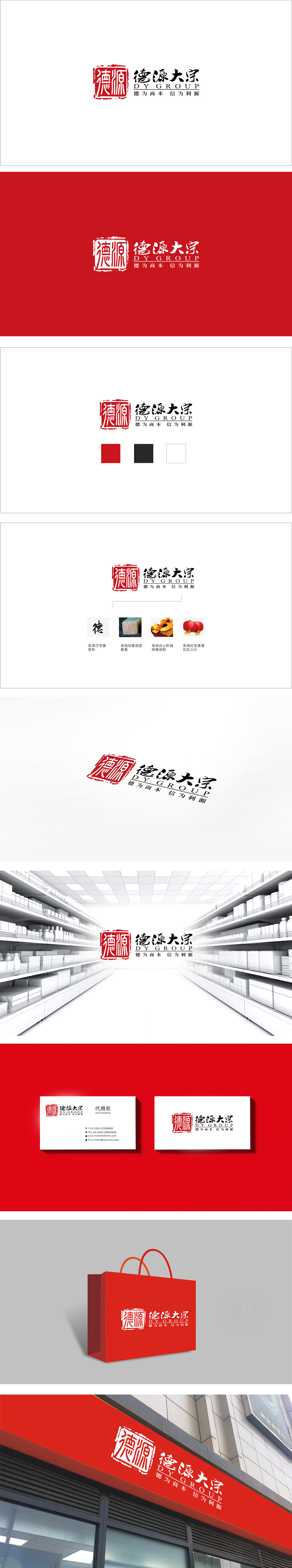
狮动设计采用朱红印泥色,模拟手写印章的不规则边缘(类似“残印”效果),既保留了传统印章的权威感(象征“信守承诺”,符合百货商超“诚信为本”的底层需求),又通过“毛边”增加了手写温度。德源大宗”主标题采用书法字体,适配百货商超“亲民但不失规范”的需求——既像邻居家的招牌一样亲切,又像老字号一样值得信赖。“德为商本 信为利源”采用四字对仗句式(“德”对“信”、“商本”对“利源”),是中国传统“楹联文化”的简化,符合中国人“对称美”的审美习惯,实现了“文化共鸣”与“商业功能”的完美统一。
Lion design adopts vermilion inkpad color to simulate the irregular edge of handwritten seal (similar to the effect of "residual seal"), which not only retains the authoritative sense of traditional seal (symbolizing "keeping promise" and meeting the bottom demand of department stores "honesty-oriented"), but also increases the handwriting temperature through "raw edge". The main title of "Deyuan Dazong" adopts calligraphy font, which meets the needs of department stores to be "close to the people but not standardized"-as kind as the signboard of the neighbor's house and as trustworthy as the old brand.


扫码或拨打添加客服微信


