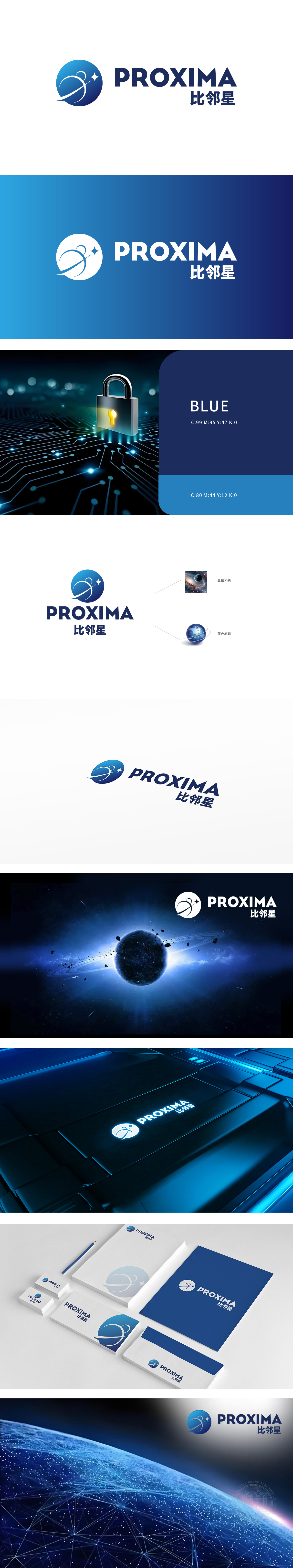
狮动设计以蓝色为主色调,象征科技、冷静与专业。图形中包含一个类似地球的球体,球体上有一条环绕的轨道,轨道上有一个小人形图案,仿佛在进行太空探索或科技研究,整体设计富有动感,传达出探索与创新的精神稀缺,球体和轨道的设计元素直接关联到科技领域的核心概念,简洁而现代的设计风格,符合科技企业追求创新、高效和前沿的形象定位。
Lion design takes blue as the main color, symbolizing technology, calmness and professionalism. The figure contains a globe similar to the earth. There is an orbit around the globe, and there is a small humanoid pattern on the orbit, which seems to be conducting space exploration or scientific and technological research. The overall design is dynamic and conveys the scarcity of exploration and innovation. The design elements of the globe and orbit are directly related to the core concepts in the field of science and technology.


扫码或拨打添加客服微信


