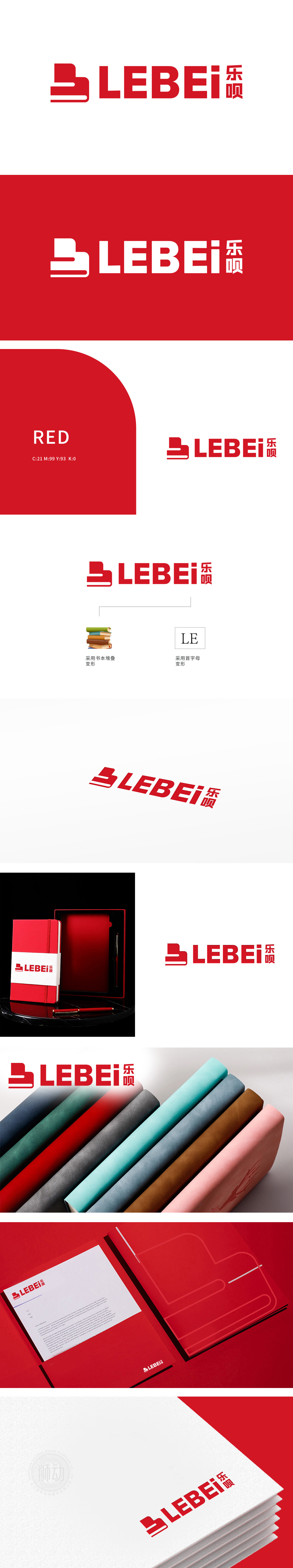
狮动设计以极具创意的视觉语言,将办公文具的实用美学与品牌精神完美融合。logo左侧采用书本堆叠变形的图形,象征知识沉淀与专业积淀,呼应办公场景中的书籍、文件等核心元素;右侧“LE”首字母变形设计,以简洁线条勾勒现代感,彰显品牌简洁高效的理念。整体红黑配色对比鲜明,传递出稳重与活力的双重特质,既符合办公文具的专业调性,又极具视觉冲击力。狮动以独具匠心的设计,不仅塑造了乐呗品牌的独特标识,更为办公文具行业注入了创新灵感,吸引新客户目光,传递专业与创意的双重价值!
Lion design perfectly combines the practical aesthetics of office stationery with the brand spirit with creative visual language. On the left side of logo, books are stacked and deformed, symbolizing knowledge precipitation and professional accumulation, echoing the core elements such as books and documents in the office scene; The deformation design of the initials "LE" on the right side outlines the modern sense with simple lines, highlighting the brand's simple and efficient concept. The overall red and black color scheme is in sharp contrast, conveying the dual characteristics of stability and vitality.


扫码或拨打添加客服微信


