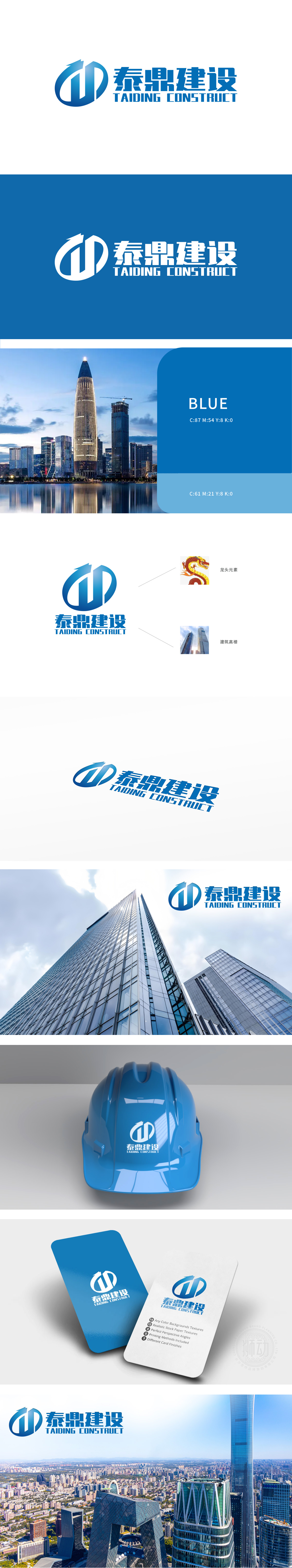
狮动设计采用蓝色调,象征稳重与专业。图形由两个箭头交织而成,形成一个类似“T”和“D”的组合,代表“泰鼎”的首字母,寓意公司的发展方向和动力。色彩选择:蓝色传达出信任、可靠和科技感,符合建设行业的特性。龙头象征力量、领导力和繁荣,与中国传统文化中的龙形象相呼应,增强品牌的文化底蕴。当龙头图腾与摩天大厦在设计中碰撞,我们不仅塑造品牌符号,更为客户铸就开拓市场的战略资产。
Lion design adopts blue tone, which symbolizes stability and professionalism. The figure is interwoven by two arrows, forming a combination similar to "T" and "D", representing the initials of "Taiding" and implying the development direction and motivation of the company. Color selection: Blue conveys a sense of trust, reliability and technology, which is in line with the characteristics of the construction industry. The leader symbolizes strength, leadership and prosperity, echoes the dragon image in China traditional culture.


扫码或拨打添加客服微信


