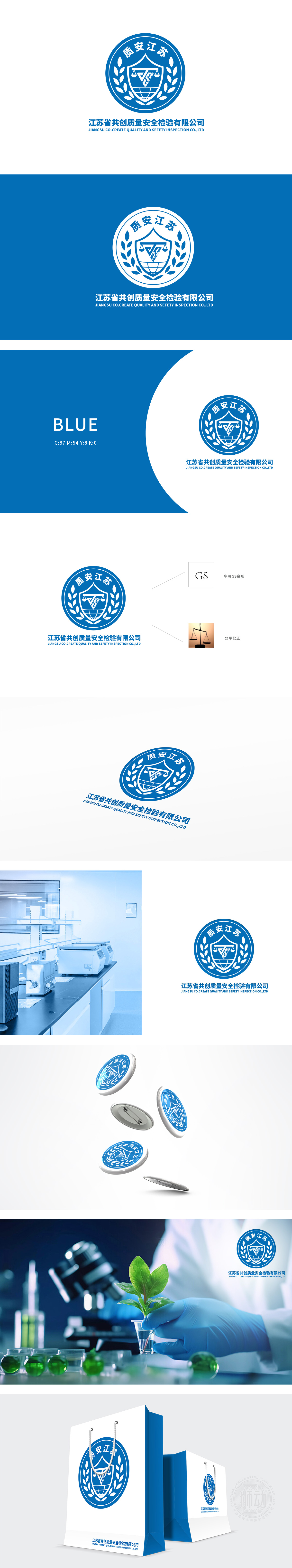
狮动设计以盾牌为轮廓,内嵌天平图案,形成视觉焦点。盾牌象征守护与责任,体现公司对质量安全的坚实保障;天平则凸显公平公正的检验原则,传递“以客观数据为基石”的专业态度。盾牌两侧的麦穗元素,以简洁线条勾勒丰收意象,隐喻“从源头把控质量,守护民生安全”的使命。蓝色主色调则传递科技感与冷静理性,与金色麦穗形成冷暖对比,平衡专业性与人文关怀,塑造有温度的品牌形象。。设计团队巧妙融合盾牌、天平、麦穗、地球等象征符号,构建出层次分明、寓意深远的图形体系,彰显企业专业性与社会担当。
Lion design takes the shield as the outline and embeds the balance pattern to form the visual focus. Shield symbolizes protection and responsibility, and embodies the company's solid guarantee for quality and safety; The balance highlights the principle of fairness and justice and conveys the professional attitude of "taking objective data as the cornerstone". The wheat ear elements on both sides of the shield outline the harvest image with simple lines, and metaphor the mission of "controlling quality from the source and protecting people's livelihood safety". The main color of blue conveys the sense of science and technology and calmness and rationality.


扫码或拨打添加客服微信


