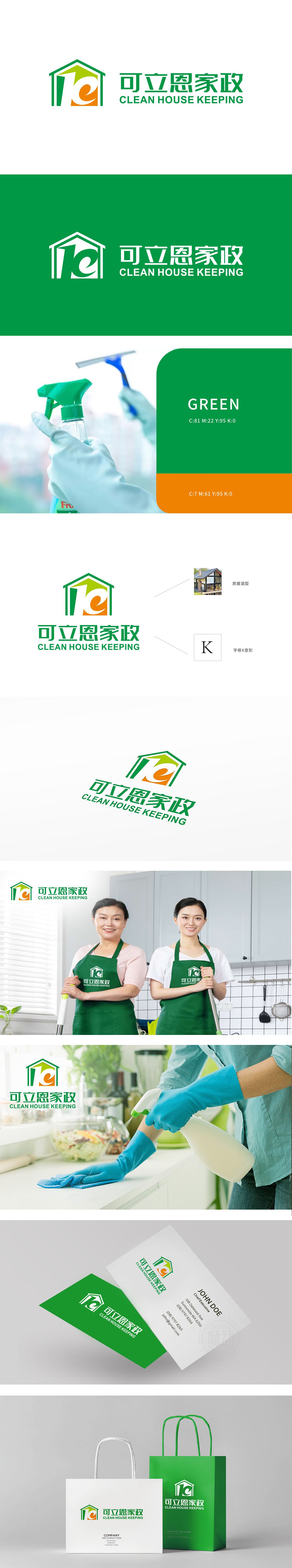
狮动设计采用了一个房屋的造型,内部包含一个变形的字母“K”过房屋造型和字母“K”的结合,既直观表达了家政服务的属性,又具有独特的视觉识别性。“房子”意象并非简单符号堆砌——斜切面设计暗喻空间纵深,暗示家政服务对家庭环境的全面覆盖;屋檐弧度如微笑曲线,传递温暖关怀。而“K”字母变形如钥匙轮廓,隐喻“打开整洁生活”的品牌承诺。这种隐喻叙事手法,让Logo超越视觉表层,成为家政价值的具象化表达。
Lion design adopts the shape of a house, which contains a deformed letter "K" through the combination of house shape and letter "K", which not only intuitively expresses the attributes of domestic service, but also has unique visual recognition. The image of "house" is not a simple symbol stack-the oblique plane design is a metaphor for the depth of space, implying the comprehensive coverage of domestic service to the family environment; The radian of the eaves is like a smile curve, conveying warm care.


扫码或拨打添加客服微信


