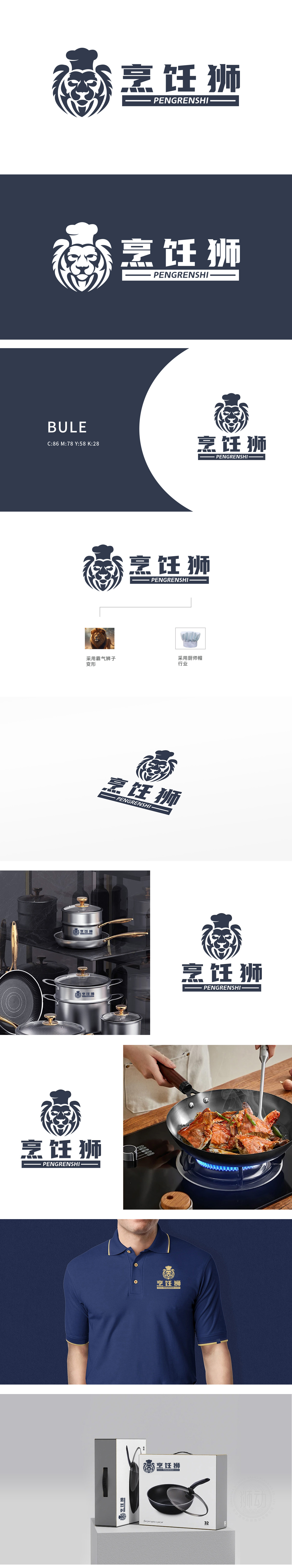
狮动设计以狮子头部为核心视觉载体,采用对称式剪纸化线条勾勒轮廓,鬃毛呈放射状卷曲,既保留狮子的威严感,又通过流畅的曲线弱化攻击性,符合中式餐饮“大气而亲和”的调性。狮眼圆睁、鼻头宽厚,传递出专注、可靠的品牌气质,暗合“烹饪狮”对食材与技艺的严谨态度。以“狮”为核心文化符号(力量、权威),植入“厨师帽”行业符号,双符号融合既传递品牌名“烹饪狮”的字面含义,又赋予“专业烹饪王者”的深层价值主张。
Lion design takes the lion's head as the core visual carrier, uses symmetrical paper-cut lines to outline the outline, and the mane curls radially, which not only retains the lion's sense of majesty, but also weakens the aggressiveness through smooth curves, in line with the tonality of Chinese catering. The lion's eyes are wide and his nose is generous, which conveys a dedicated and reliable brand temperament, which coincides with the rigorous attitude of "cooking lion" towards ingredients and skills. Taking "lion" as the core cultural symbol (strength and authority) and implanting the industry symbol of "chef's hat".


扫码或拨打添加客服微信


