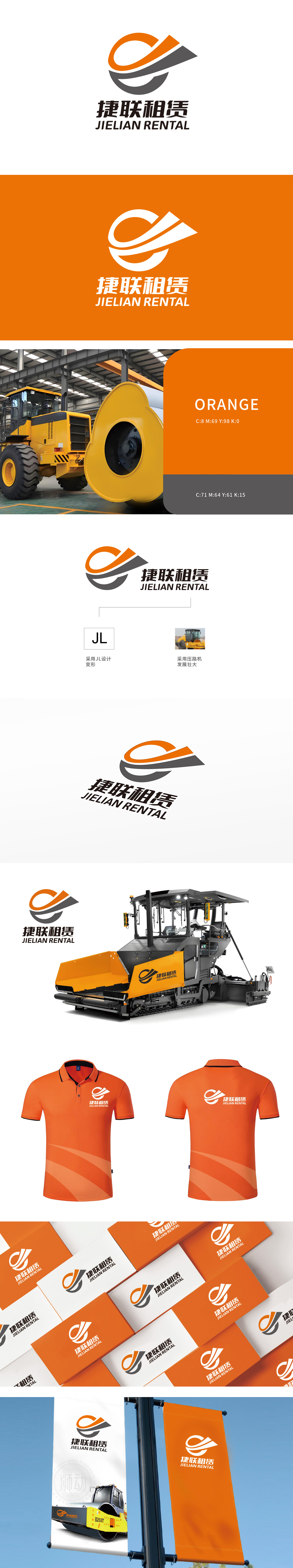
狮动设计以“JL”字母变形隐喻产品的坚固结构,灰色部分似压路机履带的厚重质感,橙色线条则象征机械运转时的动能爆发。由橙色与灰色线条交织构成,形似机械齿轮或压路机滚轴的动态轨迹,线条粗细变化与弧度转折传递出强烈的运动感与力量冲击。寓意公司以“夯实基础、稳步前行”的经营策略,实现规模化发展 整体构图极具张力、灵动、风格独特且契合主题。
Lion design uses the letter "JL" as a metaphor for the solid structure of the roller, the gray part is like the heavy texture of the roller track, and the orange line symbolizes the kinetic energy explosion during mechanical operation. It is composed of interlaced orange and gray lines, which is similar to the dynamic trajectory of mechanical gears or rollers of road rollers. The changes of line thickness and radian turn convey a strong sense of movement and power impact.


扫码或拨打添加客服微信


