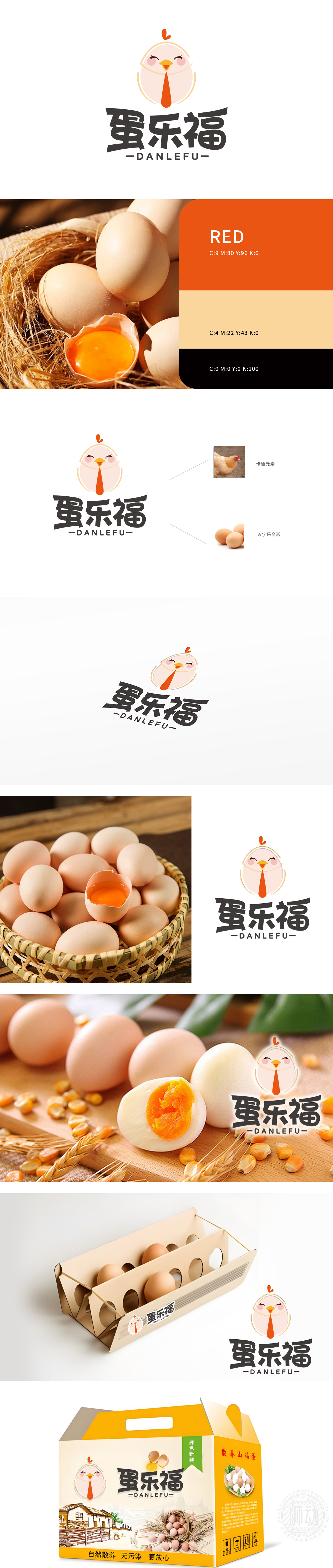
狮动设计以鸡蛋轮廓为核心视觉载体,采用圆润饱满的蛋形作为基底,传递出“新鲜、天然、孕育”的品牌联想,直观呼应“蛋”类产品属性。蛋形轮廓以简约的橙黄色线条勾勒,内部填充柔和的米白色,既保留了鸡蛋的原始形态认知,又通过色彩区分增强了视觉层次感。形成“从蛋到鸡”的生长隐喻,暗合品牌对产品品质“从源头把控”的理念。整体设计既保留了农产品品牌所需的自然、质朴,又通过卡通化处理赋予现代感与亲和力,精准匹配“蛋乐福”传递“快乐饮食、幸福生活”的品牌定位。
Lion Motion Design takes the outline of an egg as the core visual carrier, and adopts the round and full egg shape as the base, conveying the brand association of "fresh, natural and pregnant" and intuitively echoing the attributes of "eggs" products. The egg-shaped outline is outlined with simple orange-yellow lines and filled with soft beige, which not only retains the original morphological cognition of the egg, but also enhances the visual layering through color discrimination. Form a growth metaphor of "from egg to chicken", which coincides with the brand's concept of "controlling product quality from the source".


扫码或拨打添加客服微信


