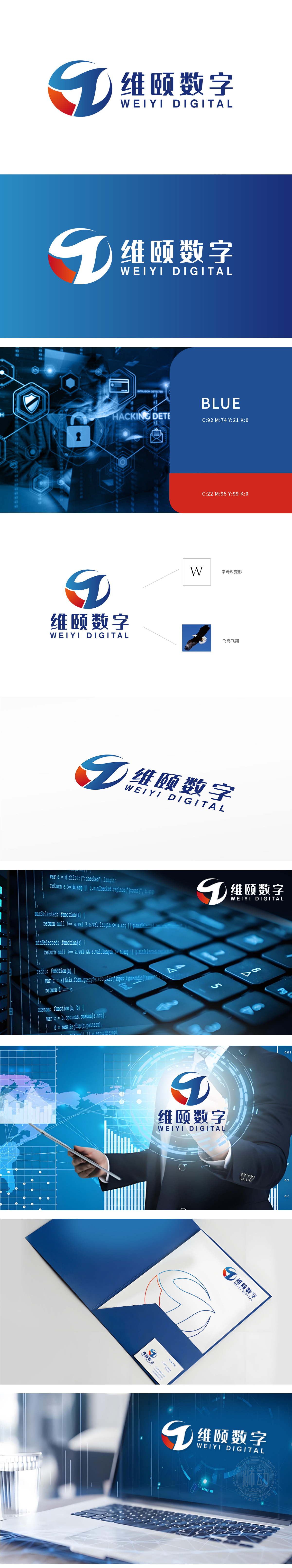
狮动设计以W字母变形:采用几何线条重构,形成流动数据流形态,象征数字世界的互联互通。蓝色渐变强化科技冷感,橙色弧线注入活力,传递创新与效率的双重基因。?飞鸟翱翔:动态羽翼线条与科技蓝背景碰撞,将自然生命力与数字化速度结合,暗示企业突破边界、引领行业变革的野心。将抽象科技与字母元素无缝衔接,用色彩与符号构建差异化视觉体系。
Lion design is deformed by the letter W: geometric lines are reconstructed to form a flowing data flow pattern, which symbolizes the interconnection of the digital world. The blue gradient strengthens the cold feeling of science and technology, and the orange arc injects vitality, conveying the dual genes of innovation and efficiency. Flying birds: dynamic wing lines collide with the blue background of science and technology, combining natural vitality with digital speed, suggesting the ambition of enterprises to break through the border and lead the industry reform.


扫码或拨打添加客服微信


