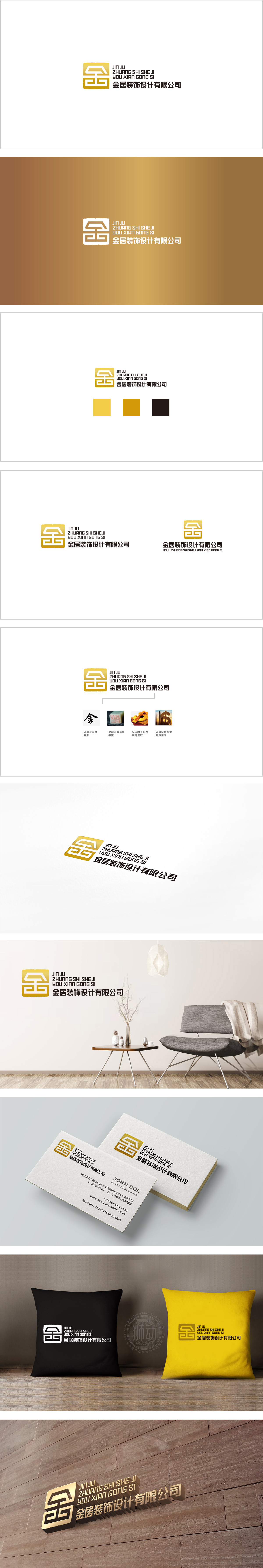
狮动设计以金色方形图标是设计的灵魂,它用“字+形”的变形组合,实现了“名称”与“行业”的双重暗示:“金”字的符号化变形:以“金”字的篆书/楷书结构为基础,直接点出公司名称中的核心词“金”,强化品牌记忆点;“房子”的行业隐喻:“金”字的“上盖”部分被处理成屋顶的轮廓,下方的“横折”则像房屋的墙体/门框,两者结合形成一个抽象的“房子”形态,直接关联装饰设计的核心业务。整体用“精准的符号”、“适配的色彩”、“平衡的布局”,把“公司名称”、“行业属性”、“品牌定位”三者完美融合:这种“字中有形、形中带意”的设计,让图形既“好看”又“好懂”,传递“信守承诺、踏实做事”的品牌形象。
Lion design takes the golden square icon as the soul of the design. It uses the deformation combination of "word+shape" to realize the double hints of "name" and "industry": the symbolic deformation of the word "gold": based on the seal script/regular script structure of the word "gold", the core word "gold" in the company name is directly pointed out to strengthen the brand memory; Industry metaphor of "house": the "upper cover" of the word "gold" is treated as the outline of the roof, and the "horizontal fold" below is like the wall/door frame of the house.
 ---
---


扫码或拨打添加客服微信


