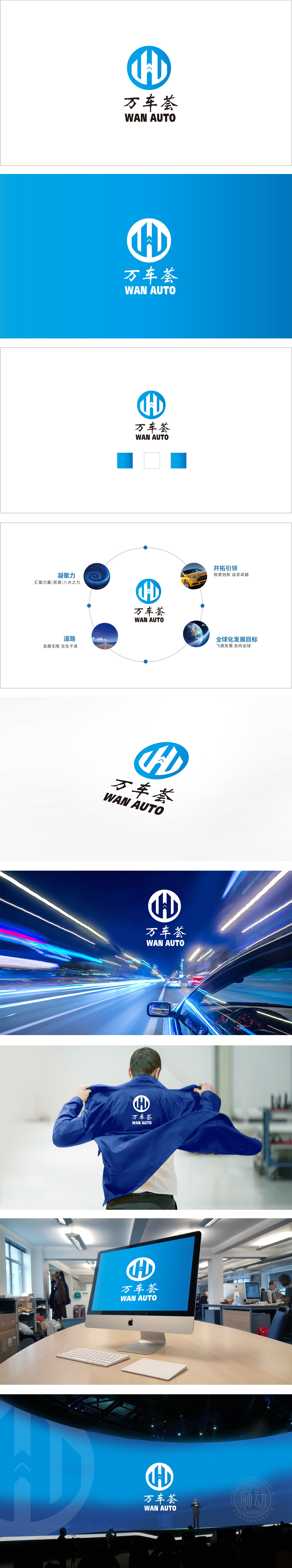
狮动设计以「W」(万的首字母)为原型,变形为「双道路/车辙」的形态,既呼应「万车齐发」的规模感,又暗合汽车「行驶于道路」的本质场景,隐喻汽车行业的「持续发展」与「场景延伸」有着「无限可能」。主色调以科技蓝为主,传递汽车行业的「专业感」与「科技感」,设计与汽车行业的「精准共鸣」,巧思与逻辑并重。
Lion design takes "W" (the initials of ten thousand) as the prototype and transforms into the shape of "two roads/ruts", which not only echoes the sense of scale of "ten thousand cars coming together", but also coincides with the essential scene of "driving on the road", implying that the "sustainable development" and "scene extension" of the automobile industry have "infinite possibilities". The main color is mainly technical blue, which conveys the sense of professionalism and technology in the automobile industry.


扫码或拨打添加客服微信


