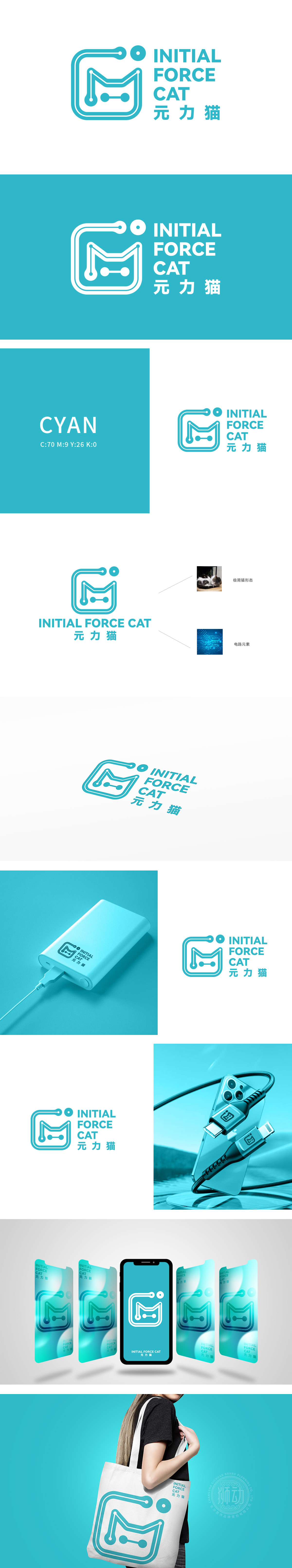
狮动设计以流畅的蓝绿色单线条勾勒出猫的抽象形态:上部“圆形+弧线”模拟猫耳与头部轮廓,中部“M”形线条巧妙构成猫的身体与蜷缩姿态,尾部以电路节点式圆点收尾,整体造型简洁却极具辨识度,完美呼应右侧实拍“卧姿猫”的慵懒灵动特征,实现“写实参考→艺术抽象”的高级转化。此LOGO通过“形态抽象化、元素融合化、气质年轻化”的设计策略,成功塑造了独特且有记忆点的品牌视觉符号,充分展现了狮动在品牌视觉设计上的专业度与创新力。
Lion Design outlines the abstract form of a cat with a smooth blue-green single line: the upper "circle+arc" simulates the outline of the cat's ears and head, the middle "M" line cleverly forms the cat's body and curled posture, and the tail ends with a circuit node dot. The overall shape is simple but highly recognizable, which perfectly echoes the lazy and agile characteristics of the right-hand real shot of "Lying Cat" and realizes the advanced transformation of "realistic reference → artistic abstraction". Through the design strategy of "abstract form, integrated elements and youthful temperament".


扫码或拨打添加客服微信


