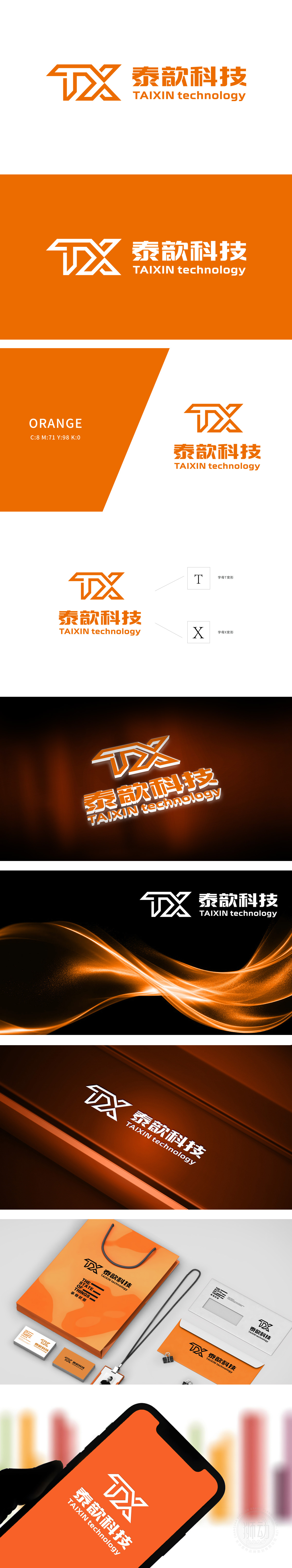
狮动设计由橙色几何图形构成,整体为“T”和“X”两个字母的艺术化变形组合。整体设计以直线、折线为主,无多余装饰,符合科技行业“简洁、高效、现代”的调性,体现专业性与未来感。科技感的线条、几何结构及橙色的创新属性,精准传达科技公司的行业定位,视觉上区别于传统行业,突出新锐感。整体通过色彩对比、字体层级和空间布局,实现信息传递的高效性与美感的统一,体现专业的视觉设计功底。
Lion design consists of orange geometric figures, and the whole is an artistic deformation combination of the letters "T" and "X". The overall design is dominated by straight lines and broken lines, without unnecessary decoration, which conforms to the tonality of "simplicity, efficiency and modernity" in the science and technology industry and reflects professionalism and futuristic feeling. The lines, geometric structure and orange innovative attributes of science and technology accurately convey the industry positioning of science and technology companies.


扫码或拨打添加客服微信


