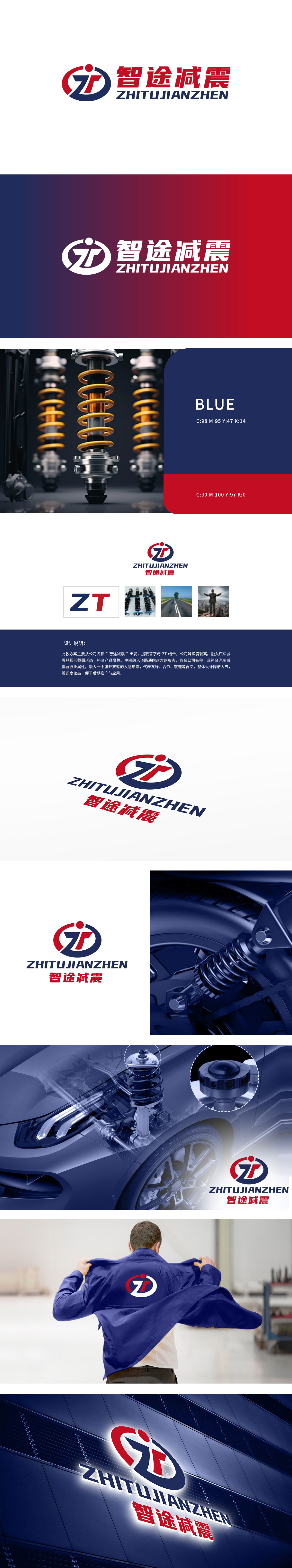
狮动设计以品牌名称“智途”首字母“ZT”为设计基础,Z(蓝)、T(红)字母通过艺术化变形结合,形成核心视觉符号,辨识度高且便于记忆。隐含“张开双臂的人物形态”(红蓝线条的环抱感),传递友好、合作、开放的品牌态度,增强亲和力。道路与愿景象征:中间线条延伸为“道路通向远方”的形态,呼应“智途”品牌名,寓意为用户提供平稳、畅通的出行体验,也象征企业发展的广阔前景,独特的设计元素组合,使logo在众多设计中脱颖而出。
Lion design is based on the initial letter ZT of the brand name Zhitu, and the letters Z (blue) and T (red) are combined through artistic deformation to form the core visual symbol, which is highly recognizable and easy to remember. It implies "the figure form with open arms" (the embracing feeling of red and blue lines), conveys a friendly, cooperative and open brand attitude and enhances affinity. Symbol of road and vision: the middle line extends to the form of "the road leads to the distance", echoing the brand name of "Zhitu".


扫码或拨打添加客服微信


