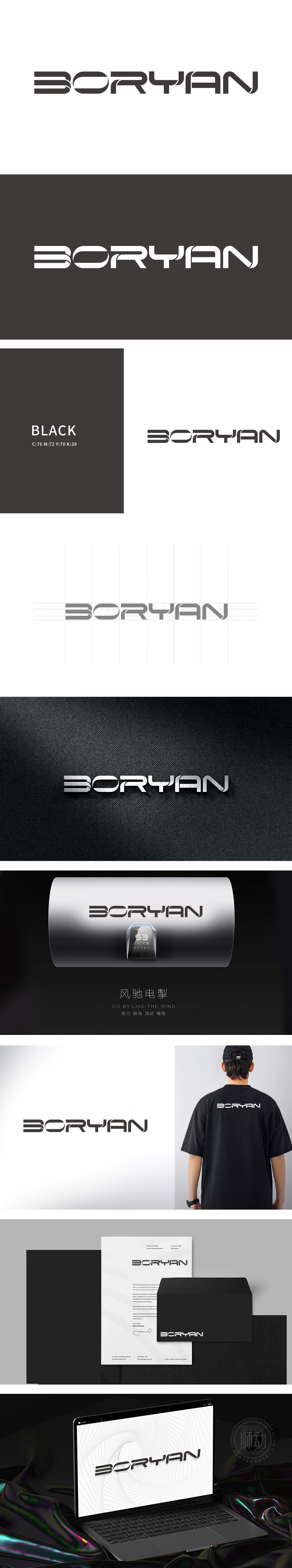
狮动设计采用B”的双环结构突破传统字母形态,可作为品牌“超级符号”独立提取,“Y”的分叉与“N”的斜切形成前后呼应的动态节奏,打破静态文字的沉闷,暗合电子产品“活力、创新”的年轻用户定位。通过几何线条、动态衔接等抽象图形语言,将“科技感、连接性、精密性”等电子产品的核心特质转化为可视化符号,整体风格偏向“未来感”,线条利落不拖沓,符合电子产品“迭代快、追求前沿”的行业节奏,符合高端产品线的视觉空间。
Lion design adopts double-ring structure of B "to break through the traditional letter form, which can be independently extracted as a brand" super symbol ".The bifurcation of Y" and the oblique cutting of N form a dynamic rhythm that echoes back and forth, breaking the dullness of static words and coinciding with the positioning of young users of electronic products. Through abstract graphic languages such as geometric lines and dynamic connection, the core characteristics of electronic products such as "sense of science and technology, connectivity and precision" are transformed into visual symbols.


扫码或拨打添加客服微信


