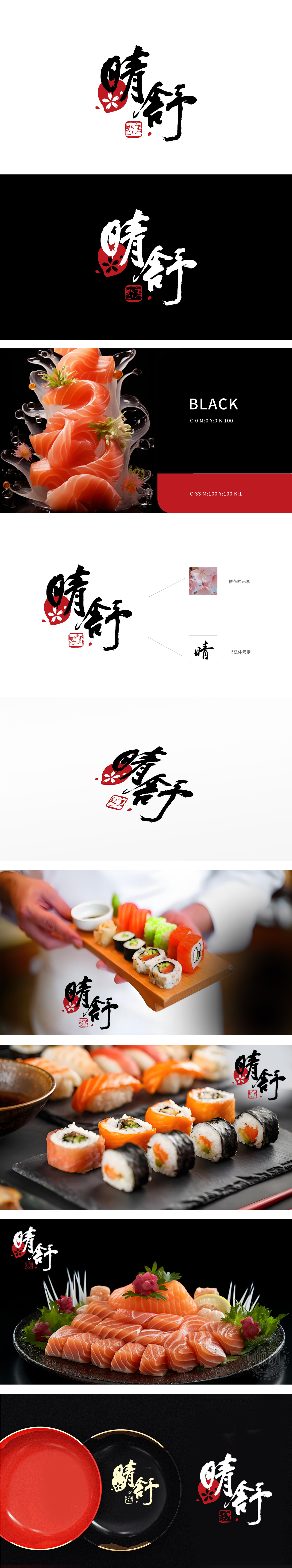
狮动设计采用潇洒灵动的毛笔书法字体,笔触粗细变化自然,笔锋舒展有力,既传递出“晴朗舒畅”的品牌意境,散落的红色花瓣点缀(左下角)模拟樱花飘落的动态感,增强画面灵动感,暗合日式料理“四季应景”“仪式感”的特色,让品牌自带场景联想。暗合“樱花绽放”的美好寓意,传递温暖、雅致的品牌调性。以书法笔触的“舒展”、樱花的“柔美”、色彩的“明快”,直观传递“晴舒”品牌所蕴含的“愉悦、舒适、积极”的情感价值,实现视觉设计与品牌理念的深度共鸣。传递手工感与匠心,贴合日式料理“手工制作”“匠人精神”的品牌联想。
Lion design adopts smart brush calligraphy font, the stroke thickness changes naturally, and the stroke tip stretches strongly, which not only conveys the brand artistic conception of "sunny and comfortable", but also simulates the dynamic feeling of cherry blossoms falling with scattered red petals (lower left corner), enhances the dynamic feeling of the picture, and coincides with the characteristics of Japanese cuisine "four seasons" and "ritual feeling", which makes the brand bring its own scene association. It coincides with the beautiful meaning of "cherry blossom" and conveys warm and elegant brand tonality. With the "stretching" of calligraphy strokes.


扫码或拨打添加客服微信


