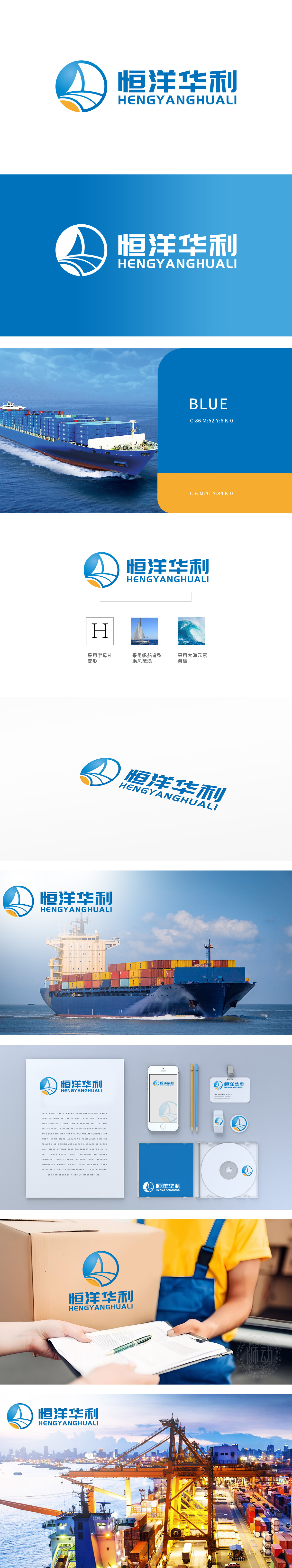
狮动设计融入品牌首字母“H”的艺术变形,以流畅线条勾勒出帆船的帆与船身轮廓,实现品牌标识与行业属性的巧妙结合。帆船造型:帆船元素直接呼应“乘风破浪”的精神,象征企业在物流领域勇往直前、高效运输的能力,同时传递出海运物流的核心业务场景。大海元素:底部橙色破浪线条与蓝色圆形背景形成海浪意象,既点明“恒洋”的“海洋”属性,也隐喻企业在海运物流中的沉稳根基与活力。
Lion design incorporates the artistic deformation of the brand initials "H", and outlines the sail and hull of a sailboat with smooth lines, realizing the ingenious combination of brand identity and industry attributes. Sailboat modeling: Sailboat elements directly echo the spirit of "riding the wind and breaking the waves", symbolize the enterprise's ability to forge ahead and transport efficiently in the logistics field, and at the same time convey the core business scene of maritime logistics. Sea element: The orange wave-breaking lines at the bottom and the blue round background form the image of waves.


扫码或拨打添加客服微信


