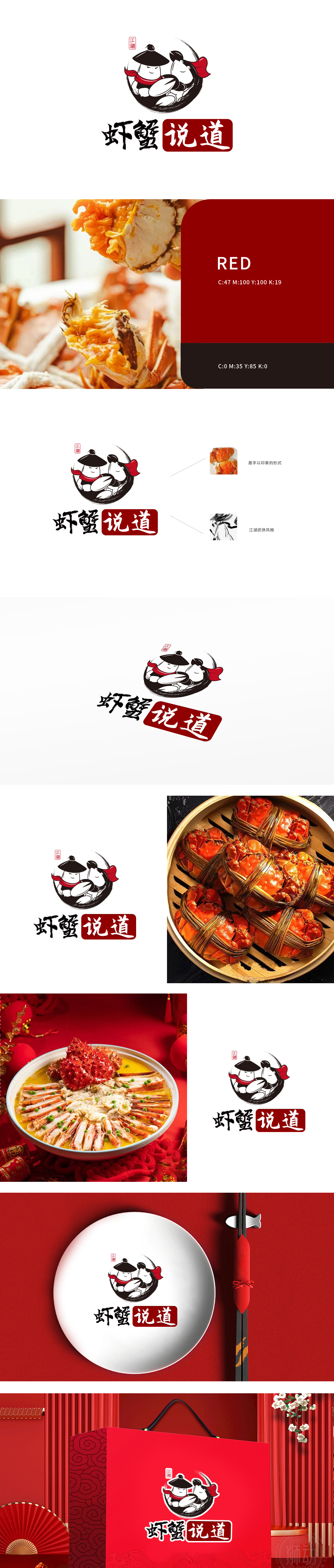
狮动设计通过拟人化“虾蟹侠客”形象,中心为两个头戴斗笠、系红色披风的拟人化角色:左侧怀抱螃蟹(圆形壳体突出品类属性),右侧手持虾钳(细长形态呼应“虾”),二者依偎形成圆形构图,传递“江湖相聚、共享美味”的氛围。服饰细节:斗笠、披风的水墨笔触线条流畅,红色披风作为点睛色,既增强视觉冲击力,又暗合餐饮行业的热情与食欲感。表情刻画:角色眯眼微笑,神态憨厚亲切,弱化武侠的凌厉感,更贴近餐饮品牌的亲和力。品类名“虾蟹”:采用黑色书法字体,笔画粗犷有力,带有毛笔飞白效果,呼应江湖武侠的手写感与传统韵味。通过“武侠IP+品类特征+文化符号”的三重融合,成功为“虾蟹说道”打造了兼具识别性、文化感与商业价值的LOGO。
Lion design personifies the image of "Xia Xie Xia Xia", with two personified characters wearing hats and red cloaks at the center: holding crabs on the left side (the circular shell highlights the category attribute) and holding shrimp tongs on the right side (the slender shape echoes "shrimp"), which form a circular composition and convey the atmosphere of "Jianghu gathering and sharing delicious food". Clothing details: The ink brush strokes of the hat and cloak are smooth, and the red cloak is the finishing touch, which not only enhances the visual impact, but also coincides with the enthusiasm and appetite of the catering industry. Expression portrayal: the role squints and smiles, and the expression is simple and kind, which weakens the sense of fierceness of martial arts and is closer to the affinity of catering brands.


扫码或拨打添加客服微信


