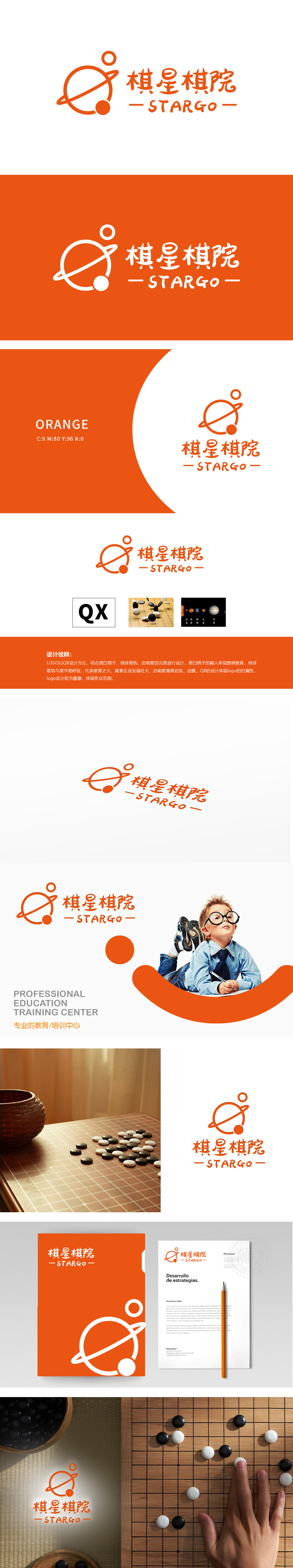
狮动设计以“QX”(棋星拼音首字母)为骨架,通过流畅曲线连接成“地球星轨”意象,外圈轨道环绕星球,内嵌小圆形似“启明星”,呼应“棋星”之名,寓意“启智启蒙、星火燎原”的教育愿景。橙色调的星轨与星球造型弱化了传统棋类的严肃感,增添童趣,。 橙色为主色调,传递活力与亲和力,契合教育品牌的温暖属性。设计融合多重核心元素:将“棋艺”与“星辰”关联,赋予品牌“探索、成长、广阔视野”的延伸内涵。通过“符号化+故事化”的设计策略,既实现了教育品牌的专业性表达,又以童趣化的视觉语言拉近与目标群体的距离。
Lion design takes "QX" (the initial letter of chess star pinyin) as the skeleton, which is connected into the image of "Earth's star orbit" through smooth curves. The outer orbit surrounds the planet, and a small circle is embedded like a "morning star", echoing the name of "chess star" and implying the educational vision of "enlightening, enlightening and single spark can start a prairie fire". The orange-toned star track and star shape weaken the seriousness of traditional chess and increase childlike interest. Orange is the main color, which conveys vitality and affinity and fits the warm attribute of educational brands.


扫码或拨打添加客服微信


