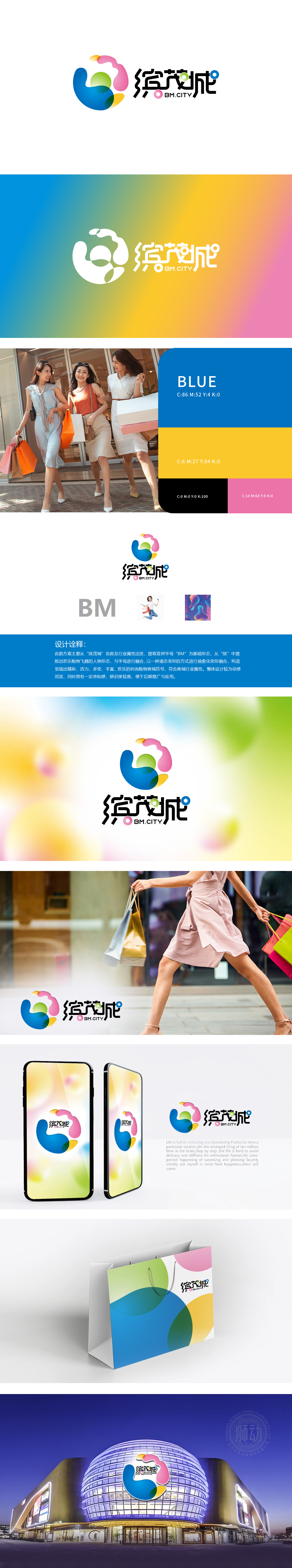
狮动设计提取“缤茂城”首字母“BM”作为LOGO核心架构,字母“B”“M”以流畅线条连接,形成稳固且富有张力的视觉基底,既体现品牌专属性,又隐喻商业空间的包容性。从“缤”(缤纷、多彩)中提炼“欢乐购物腾飞的人物形态”,以液态渐变色彩(蓝、绿、粉、黄)抽象化呈现,线条灵动飘逸,如同跳跃、舞动的消费者,直接关联购物中心的“购物体验”与“愉悦感”。主色调采用蓝、绿、粉、黄等明快色彩,搭配柔和渐变,营造活泼、时尚、多元的商业氛围,符合购物中心面向年轻家庭及潮流消费群体的定位;以“字母+人物意象+液态色彩”的创新融合,成功塑造了一个兼具活力与亲和力的购物中心品牌符号。
Lion Motion Design takes the initials B”“M of Binmao City as the core structure of the LOGO, and the letters B and M are connected by smooth lines, forming a stable and tense visual base, which not only reflects the brand specificity, but also implies the inclusiveness of commercial space. From the "Bin" (colorful and colorful), the "figure form of happy shopping soaring" is abstractly presented in liquid gradient colors (blue, green, pink and yellow), and the lines are smart and elegant, just like jumping and dancing consumers, which directly relates to the "shopping experience" and "pleasure" of shopping centers. The main colors are bright colors such as blue, green, pink and yellow, with soft gradients, creating a lively, fashionable and diversified business atmosphere.


扫码或拨打添加客服微信


