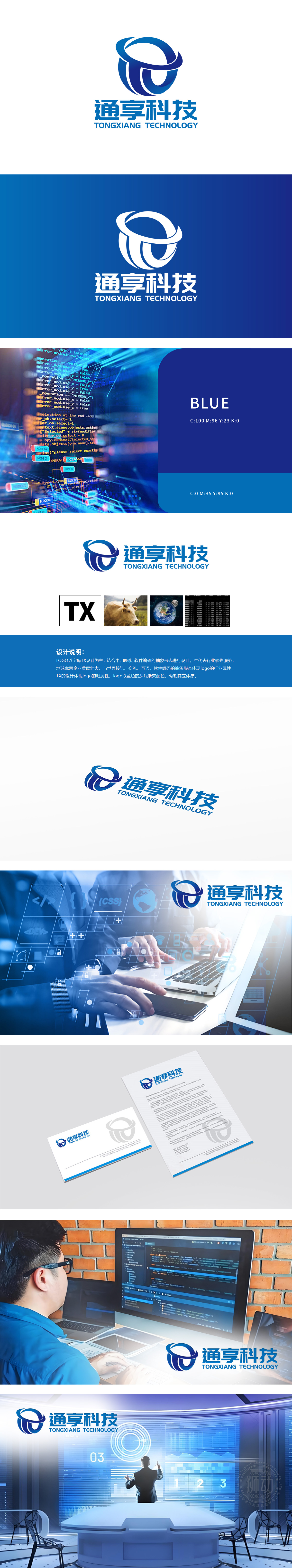
狮动设计以“TX”为核心,通过流畅的环形线条与几何切割,既保留字母识别性,又融入“软件编码的抽象形态”——环形结构可联想为数据循环、网络连接,线条的穿插感类似代码逻辑的交互,强化互联网科技的技术内核。蓝色在互联网行业中常用于传递“技术可靠、信任、专业”,图像中融入抽象牛元素,行业领先与开拓精神:象征“行业领先优势”,在互联网语境中可延伸为“技术突破”“市场开拓力”(如“独角兽”“领军企业”的隐喻),传递品牌在竞争中的硬核实力。整体设计 以技术为基(代码)、以领先为势(牛)、以连接为任(地球/环形),直观传递“以技术为驱动”的定位,增强专业可信度。
Lion Motion design takes "TX" as the core, and through smooth circular lines and geometric cutting, it not only retains the letter recognition, but also integrates into the "abstract form of software coding"-the circular structure can be associated with data circulation and network connection, and the interpenetration of lines is similar to the interaction of code logic, which strengthens the technical core of Internet technology. Blue is often used to convey "reliable technology, trust and professionalism" in the Internet industry, and the image incorporates abstract ox elements, leading the industry and pioneering spirit.


扫码或拨打添加客服微信


