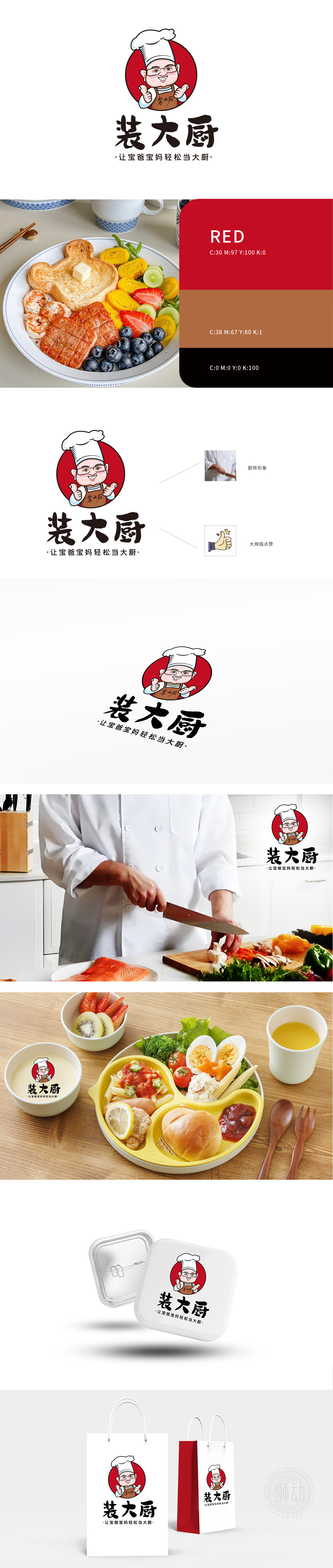
狮动设计以戴白色高帽、穿棕色围裙的Q版厨师为核心视觉符号,形象亲和圆润,眉眼带笑,传递专业、可靠且友好的品牌气质。围裙上的“老厨”字样强化厨师身份,增强信任感。采用毛笔风格书法字体,笔画厚重有力,兼具“匠心”与“趣味感”,“装”字巧妙消解了“成为大厨”的压力,传递轻松、易上手的品牌理念。整体设计采用卡通化、轻量化设计,避免传统餐饮品牌的严肃感,更贴近“新手爸妈”轻松育儿、快乐烹饪的需求,体现品牌亲和力。
Lion design takes the Q chef wearing a white top hat and a brown apron as the core visual symbol, and the image is friendly and round, with an eyebrow and a smile, conveying professional, reliable and friendly brand temperament. The word "old chef" on the apron strengthens the identity of the chef and enhances trust. The brush style calligraphy font is adopted, and the strokes are thick and powerful, which has both "ingenuity" and "sense of interest". The word "outfit" skillfully relieves the pressure of "becoming a chef" and conveys the brand concept of being easy to use.


扫码或拨打添加客服微信


