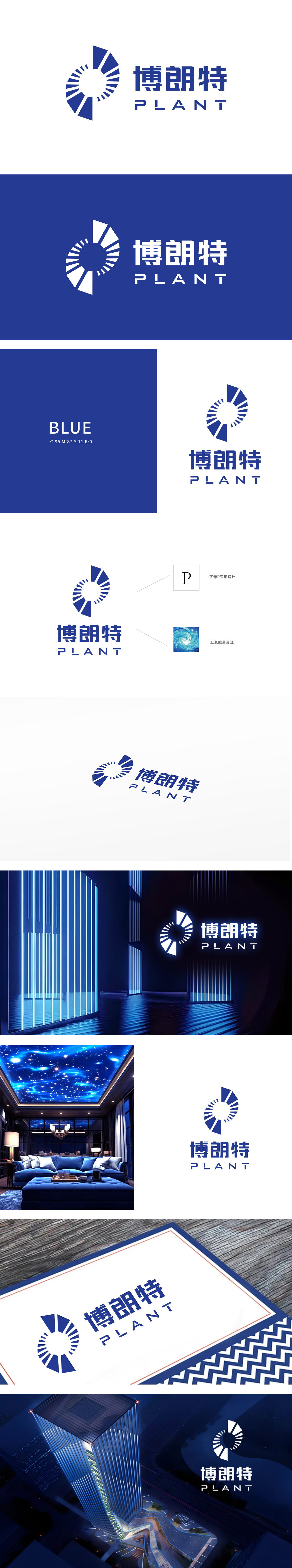
狮动设计以字母“P”为核心,通过放射状线条的疏密、渐变处理,精准模拟了“灯光聚焦-扩散”的物理特性,传递“点亮空间”“能量辐射”的照明行业本质。大面积深蓝色象征专业照明技术的稳重与科技感,中心留白形成的“高光区域”与放射线条的明暗对比,强化了“光源核心”的视觉焦点,暗合照明产品“以光为中心”的功能属性,“朗”字直接呼应“光明、明亮”,字体采用粗壮黑体,笔画边缘锐利如光束切割,传递照明产品的“聚焦”与“穿透力”;漩涡的动态感暗喻照明场景的“氛围营造力”——如同灯光在空间中流动、铺展,赋予环境生命力,与“博朗特”作为照明品牌的核心价值高度契合。
Lion Motion design takes the letter "P" as the core, and accurately simulates the physical characteristics of "light focusing-diffusion" through the density and gradual treatment of radial lines, and conveys the essence of lighting industry of "lighting space" and "energy radiation". A large area of dark blue symbolizes the steadiness and scientific sense of professional lighting technology. The contrast between the bright and dark areas formed by the blank center and the radiation lines strengthens the visual focus of the "light source core", which coincides with the functional attribute of "light-centered" lighting products.


扫码或拨打添加客服微信


