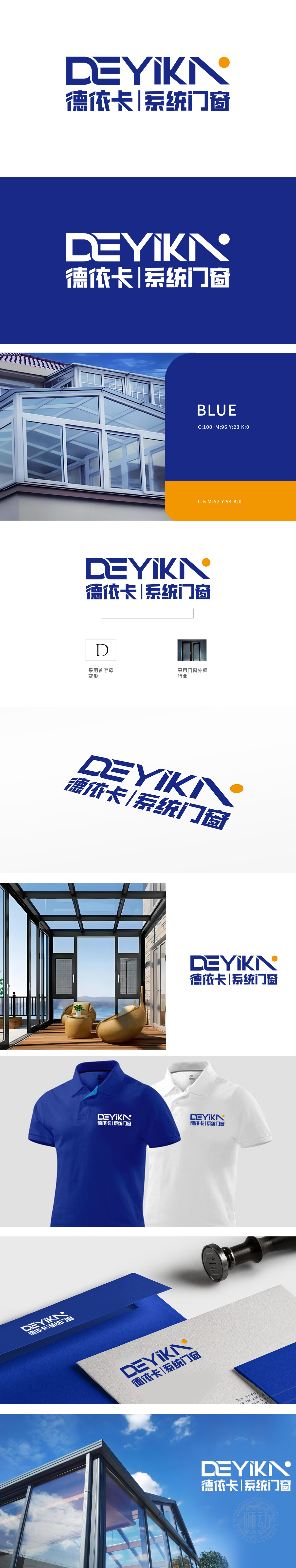
狮动设计以字母“D”“K”边缘融入几何切割线条,既保留字母识别性,又通过直线与斜线的组合隐喻门窗框架的结构感,呼应“系统门窗”的行业属性,强化品牌在“系统化设计、标准化生产”上的专业形象;首字母变形与门窗外框的双重符号,构建“品牌-产品-行业”的三重认知锚点,逻辑清晰。深蓝色代表专业、可靠与科技感,契合“系统门窗”对质量与技术的高要求;右上角橙色圆点作为点缀,打破蓝色的沉稳,增添温暖与活力,隐喻门窗带来的“空间温度”与“阳光感”,整体设地结合门窗产品的“结构、光影、空间”核心属性,通过视觉符号(框体、线条、色彩)实现“看LOGO即知行业”的直观传达。
Lion design is dominated by straight lines, and the edges of letters "D" and "K" are blended with geometric cutting lines, which not only retains the letter recognition, but also reflects the structural sense of the door and window frame through the combination of straight lines and diagonal lines, echoing the industrial attributes of "systematic doors and windows" and strengthening the professional image of the brand in "systematic design and standardized production"; The double symbols of the initial deformation and the window frame of the door build a triple cognitive anchor point of "brand-product-industry".which is clear in logic. Dark blue represents professionalism, reliability and sense of science and technology.


扫码或拨打添加客服微信


