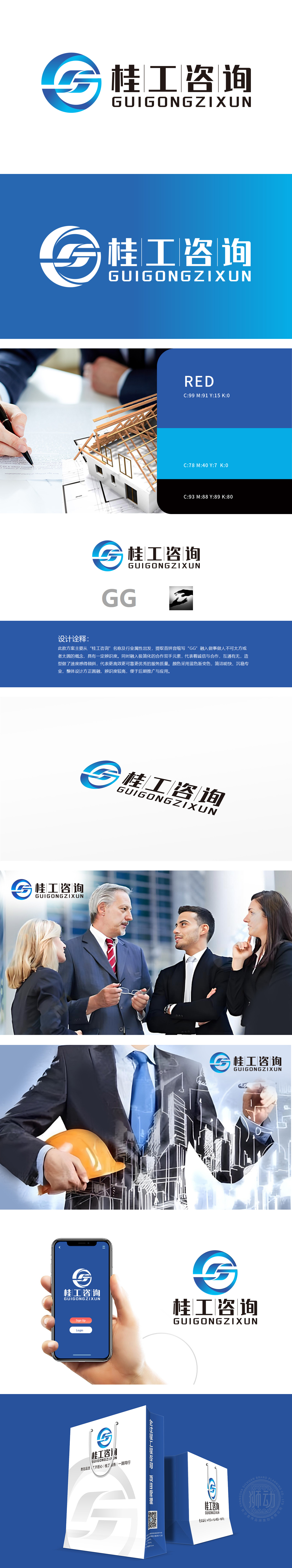
狮动设计以“桂工咨询”首拼“GG”为核心,通过蓝色渐变圆形与抽象线条组合,形成兼具“方正”与“圆润”的动态造型,传递高效、专业的服务属性。“GG”字母与“合作双手”剪影呼应,强化“诚信、合作、互通”的品牌价值观,贴合咨询行业依赖信任与协作的核心需求。色彩策略:蓝色渐变为主色调,符合咨询行业“沉稳、可靠、专业”的心理预期,同时渐变效果增加现代感,提升视觉记忆点。该logo通过极简设计(便于记忆与应用)、行业属性色彩(蓝色)、价值观符号(合作双手),传递出“专业度+信任感+解决方案的能力”。
Lion Motion Design takes the first spelling "GG" of "Guigong Consulting" as the core, and through the combination of blue gradient circle and abstract lines, it forms a dynamic modeling with both "founder" and "roundness" and conveys efficient and professional service attributes. The letter "GG" echoes the silhouette of "cooperative hands", which strengthens the brand values of "honesty, cooperation and interoperability" and fits the core needs of consulting industry relying on trust and cooperation.At the same time, the gradient effect increases the sense of modernity and enhances the visual memory.


扫码或拨打添加客服微信


