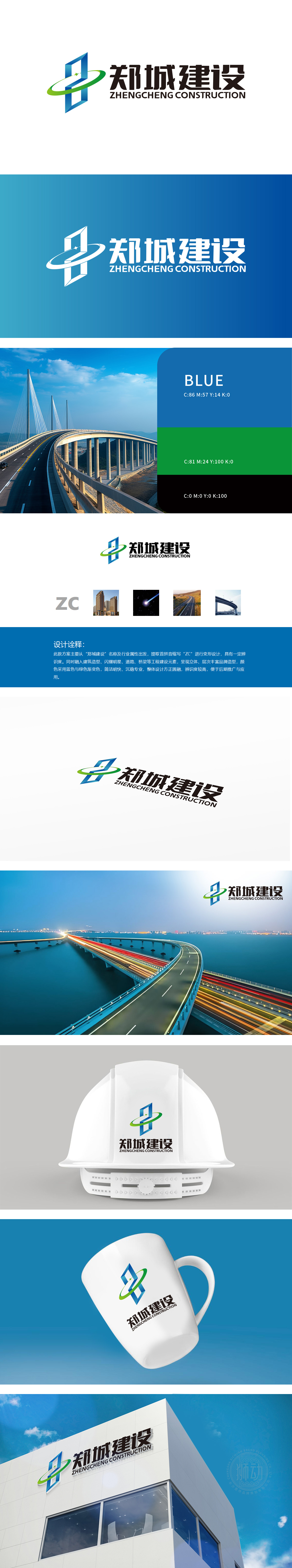
狮动设计以品牌首字母“ZC”变形为核心,蓝色立体几何结构形似高楼或桥梁的骨架,顶部环绕的绿色渐变圆环,既象征道路/桥梁的延伸感,也暗合工程建设中“连接”与“贯通”的意象。强化了品牌在基础设施建设领域的专业定位。色彩上采用蓝绿渐变,蓝色代表专业、沉稳,绿色象征可持续发展,与现代桥梁建设中对环保和品质的追求相契合。整体造型“方正圆融”,既体现建筑结构的稳固感,也呼应高架桥在城市规划中“刚柔并济”的视觉特点。色彩与造型兼顾行业专业性与现代感。
Lion Motion design takes the deformation of brand initials "ZC" as the core, the blue three-dimensional geometric structure is shaped like the skeleton of a high-rise building or bridge, and the top is surrounded by a green gradual ring, which not only symbolizes the extension of roads/bridges, but also coincides with the images of "connection" and "penetration" in engineering construction. Strengthened the brand's professional positioning in the field of infrastructure construction.


扫码或拨打添加客服微信


