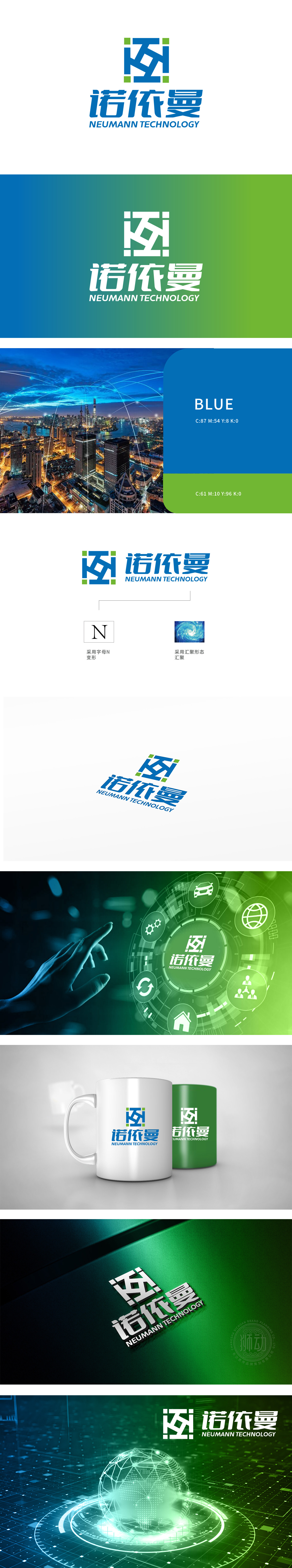
狮动设计以字母“N”为原型,通过直线切割、方形模块拼接和对称结构设计,形成“电路网格”“芯片逻辑门”或“模块化组件”的视觉意象。蓝色主色调:蓝色在科技领域常象征“专业、信任、创新”,是科技品牌的经典配色;通过动感的线条和渐变色彩,传递出“资源整合”“数据流转”“技术向心力”的科技概念,与几何图形形成“静态结构+动态能量”的互补,暗示科技企业的稳定性与创新活力。企业名称策略直接绑定了“计算机科学、信息技术、前沿科技”的认知,使LOGO在视觉之外,通过名称自带科技基因,强化品牌的专业属性与行业定位。
Lion design takes the letter "n" as the prototype, and forms the visual image of "circuit grid", "chip logic gate" or "modular component" through straight line cutting, square module splicing and symmetrical structure design.Blue main color: blue often symbolizes "professionalism, trust and innovation" in the field of science and technology, and is a classic color matching of science and technology brands; Through dynamic lines and gradient colors, the scientific and technological concepts of "resource integration", "data flow" and "technical centripetal force" are conveyed.which complement geometric figures to form "static structure+dynamic energy".


扫码或拨打添加客服微信


