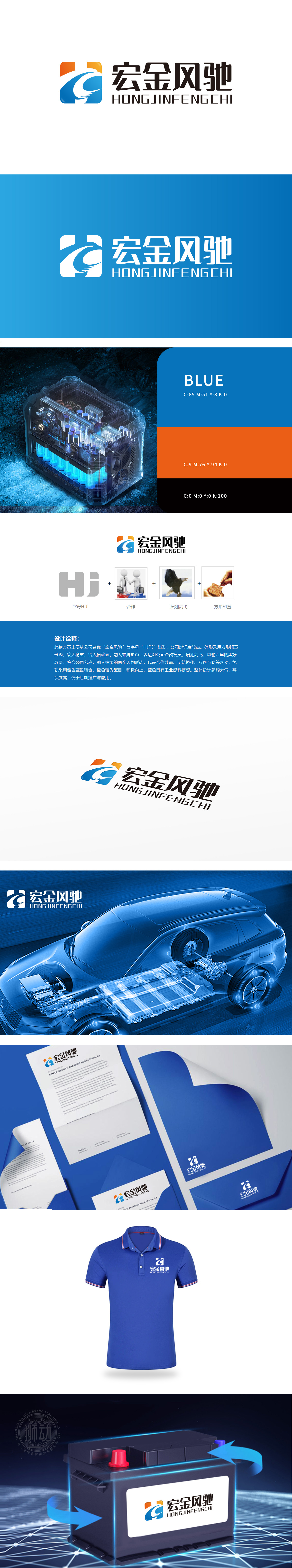
狮动团队深度挖掘品牌“速度、能量、科技”的核心诉求,以抽象变形字母“H”为基底,融合流线型羽翼元素,橙色与黄色渐变象征能量释放,蓝色锚定科技质感。初稿即获客户高度认可,称赞设计精准传递品牌张力。整体感特别强,品牌识别度非常高。
The Lion Movement team deeply explores the core appeal of the brand "speed, energy and technology", taking the abstract deformed letter "H" as the base, integrating streamlined wing elements, and the gradual change of orange and yellow symbolizes energy release, and the blue anchors the technical texture. The first draft was highly recognized by customers, praising the design for accurately transmitting brand tension.


扫码或拨打添加客服微信


