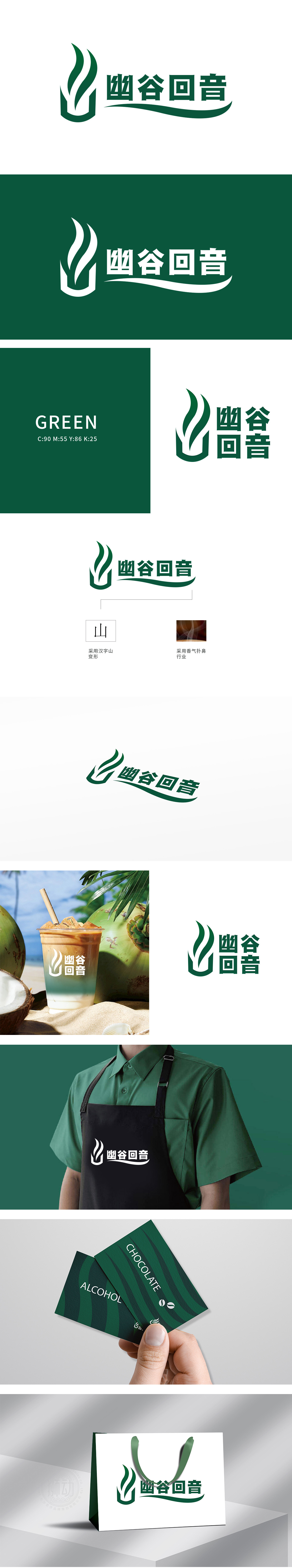
狮动设计以绿色渐变为主色调,采用汉字“山”为原型进行抽象化设计:底部的“山”字轮廓稳固厚重,象征“幽谷”的沉稳与自然;上部延伸出飘逸的曲线,形似山巅升起的云雾或灵动的植物叶片,传递“回音”的轻盈与韵律感,整体造型兼具力量感与流动美。中文名称采用墨绿色书法字体,笔触流畅自然,与图形的曲线感形成呼应;字体下方搭配一条水平飘逸的弧线,既强化了“回音”的听觉联想,又平衡了整体构图,增强视觉延伸性。整体设计融合自然美学与东方禅意,绿色主色调传递健康、清新、生态的品牌调性,强调“自然原料”“传统工艺”或“宁静体验”的品牌。
Lion design takes green gradient as the main tone, and uses the Chinese character "mountain" as the prototype for abstract design: the outline of the word "mountain" at the bottom is stable and heavy, symbolizing the calmness and nature of "the valley"; An elegant curve extends from the upper part, which looks like a cloud rising from the top of a mountain or a smart plant leaf, conveying the lightness and rhythm of "echo", and the overall shape has both a sense of strength and a sense of fluidity. Chinese names use dark green calligraphy font, and the strokes are smooth and natural.


扫码或拨打添加客服微信


