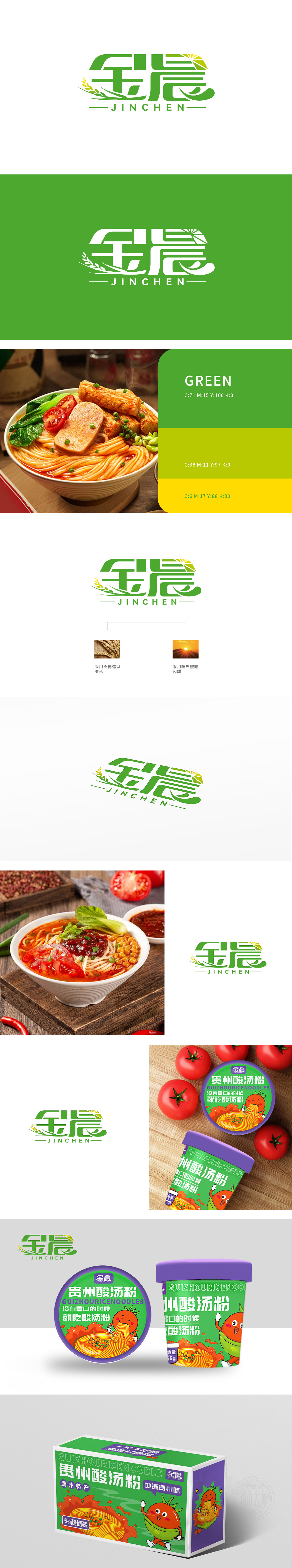
狮动设计以“金晨”采用绿色书法体变形,笔画流畅且兼具力量感,右侧“晨”字上方融入阳光光芒图形,直接呼应“晨”的时间概念,象征清晨的活力与希望。绿色麦芒与金黄麦穗作为装饰元素,从“金”字下方延伸而出,既强化自然、生态的行业属性,也通过麦穗的成熟意象传递“收获、品质”的品牌联想。以绿色为主色调(象征自然、新鲜、生命力),搭配黄色作为点缀,色彩明快且具有积极联想,符合大众对健康、天然类品牌的视觉期待。其设计成功塑造了“源于自然、充满活力、品质可靠”的品牌形象。
Lion design uses the green calligraphy style of "Gina", with smooth strokes and a sense of strength. On the right side, the word "morning" is blended with the sunlight figure, which directly echoes the time concept of "morning" and symbolizes the vitality and hope of the morning. As decorative elements, green wheat awn and golden wheat ear extend from the bottom of the word "gold", which not only strengthens the industrial attributes of nature and ecology, but also conveys the brand association of "harvest and quality" through the mature image of wheat ear.


扫码或拨打添加客服微信


