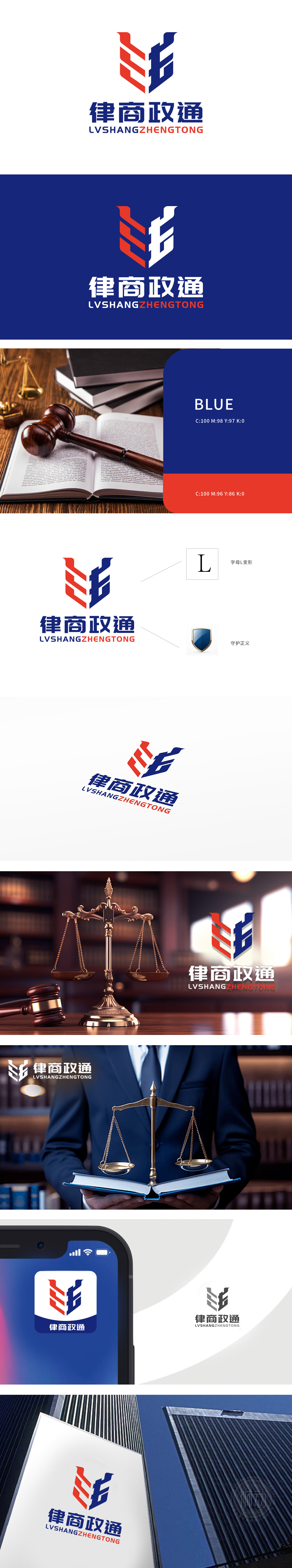
狮动为律商政通打造的LOGO,以红蓝交织的抽象双“L”造型为核心,精准诠释品牌“法律+商业+政务”的融合定位。设计团队深入挖掘行业特质,通过几何线条构建信任感与专业性,动态交织结构象征资源整合与协作共赢。色彩上采用沉稳蓝与活力红碰撞,传递权威与创新并存的品牌形象。整体设计简洁有力,兼具辨识度与延展性,有效提升品牌视觉记忆点,成为律商政通专业服务的最佳视觉代言。狮动以策略先行+创意落地,为客户打造直击核心的商业符号。
The LOGO created by Lion Motion for Law, Commerce and Government is centered on the abstract double "L" shape interwoven with red and blue, and accurately interprets the integrated positioning of the brand "law+commerce+government affairs". The design team deeply digs into the characteristics of the industry, builds trust and professionalism through geometric lines, and the dynamic intertwined structure symbolizes resource integration and win-win cooperation. In color, calm blue collides with energetic red to convey the brand image of coexistence of authority and innovation. The overall design is concise and powerful.


扫码或拨打添加客服微信


