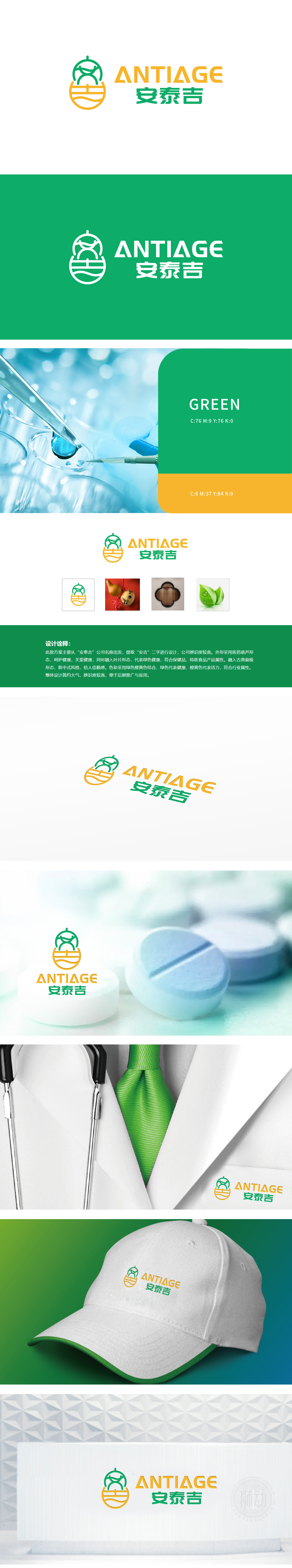
狮动设计从“安泰吉”名称中提取“安吉”二字进行视觉化设计:采用传统“医药葫芦”造型,葫芦在中医药文化中是悬壶济世的象征,直接关联药品、医疗健康行业属性,传递“呵护健康”的品牌理念,符合用户“药品医疗”的核心需求。葫芦顶部绿色线条巧妙构成“吉”字的意象,下方橙黄色部分融入“安”字的稳健感,既强化品牌名称记忆,又暗合“平安康泰”的医疗健康愿景。整体LOGO采用新中式风格,通过医药葫芦的经典符号、健康色彩体系、传统文化与行业属性的融合, 同时通过“窗”的意象传递“通透、安心”感,符合医疗行业对“信赖感”的需求。
Lion Design extracts the word "Anji" from the name "Antaiji" for visual design: it adopts the traditional "medicine gourd" shape, which is a symbol of saving the world in Chinese medicine culture, directly related to the attributes of medicine and medical health industry, and conveys the brand concept of "caring for health", which meets the core needs of users for "medicine and medical care". The green lines on the top of the gourd skillfully form the image of the word "Ji", and the orange part below blends in the sense of stability of the word "An", which not only strengthens the brand name memory, but also coincides with the medical and health vision of "Safe and Healthy".


扫码或拨打添加客服微信


