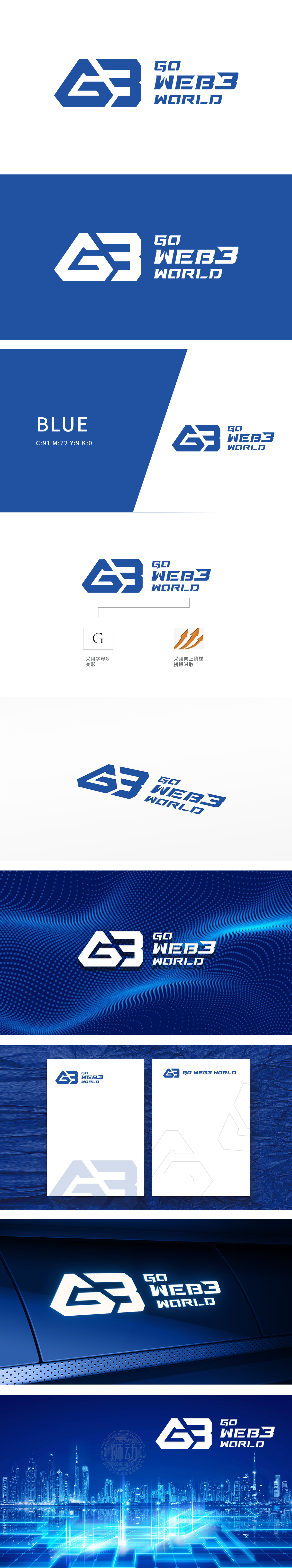
狮动设计以字母“G”为原型,通过几何切割与叠加形成“G3”一体化符号,蓝色主调传递科技感与信任感,线条硬朗且富有动感,“G”既呼应品牌首字母,也暗合(全球化)”“(增长)”的行业愿景;数字“3”则直接关联“Web3”核心概念,强化品牌定位记忆。科技感表达:几何化字母、渐变箭头、蓝橙配色组合,能快速建立“前沿、专业、数字化”的品牌联想,符合互联网领域对技术属性与未来感的视觉需求。
Lion design takes the letter "G" as the prototype, and forms an integrated symbol of "G3" through geometric cutting and superposition. The blue theme conveys the sense of science and technology and trust, and the lines are tough and dynamic. The "G" not only echoes the brand initials, but also coincides with the industry vision of "globalization" and "(growth)". The number "3" is directly related to the core concept of "Web3" and strengthens the brand positioning memory. Expression of scientific sense: Geometric letters, gradient arrows and blue-orange color combinations can quickly establish "cutting-edge, professional and digital" brand association.


扫码或拨打添加客服微信


