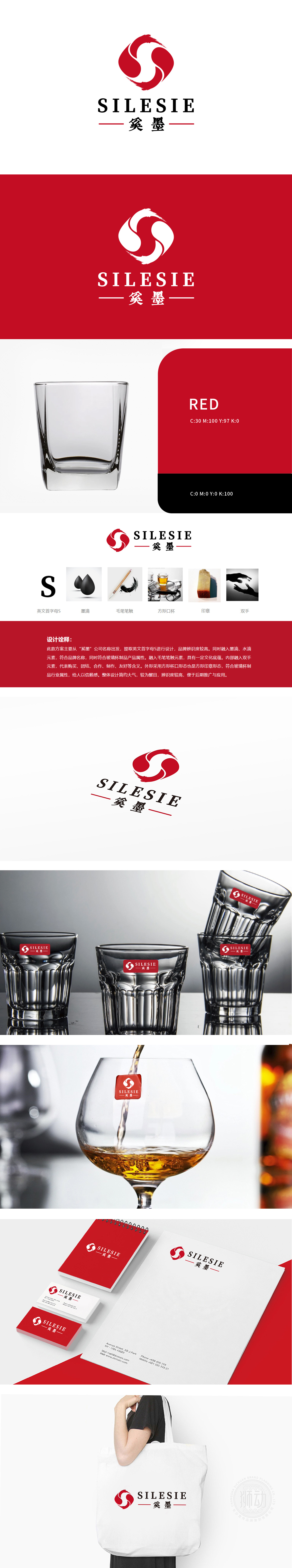
奚墨狮动以品牌logo核心元素为灵感,将抽象的“S”形笔锋与墨滴轨迹融入杯身曲线,流畅线条呼应毛笔书写的韵律感。红色杯柄如落笔的墨点,与黑色丝印品牌名称形成视觉呼应,既强化品牌识别度,又赋予产品文化质感。上市后收获市场好评,成功助力品牌提升文化溢价与消费者情感共鸣。
Inspired by the core elements of the brand logo, Xi Moshidong integrates the abstract "S"-shaped pen tip and ink droplet trajectory into the cup curve, and the smooth lines echo the rhythm of writing with a brush. The red cup handle, such as ink dots, forms a visual echo with the brand name of black silk screen printing, which not only strengthens the brand recognition, but also gives the product a cultural texture. After listing, it gained favorable comments from the market and successfully helped the brand to enhance the cultural premium and resonate with consumers' emotions.


扫码或拨打添加客服微信


