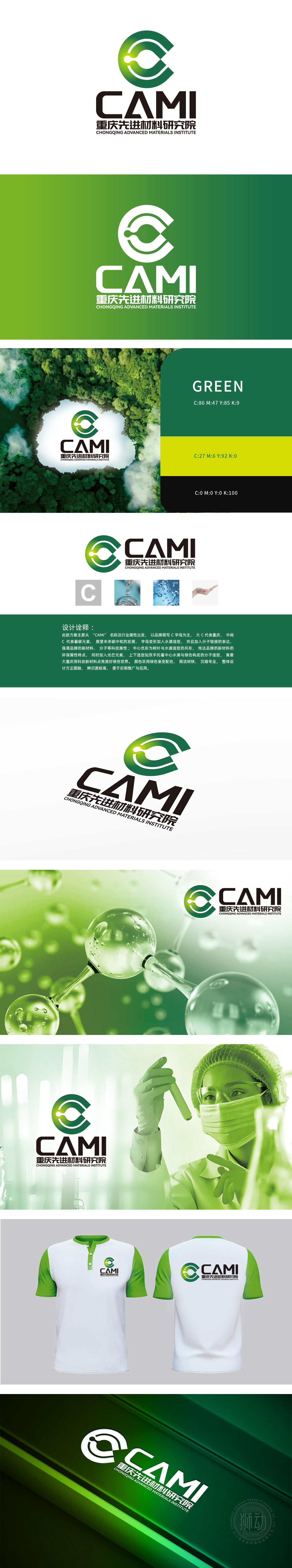
狮动设计采用品牌简称“CAMI”首字母“C”为核心设计元素,左侧大“C”代表“重庆”地域属性,中间嵌套的小“C”巧妙隐喻“碳元素,直接关联化工、材料科学的核心研究对象,强化行业属性认知。“C”字母内部融入水滴造型与分子链结构,直观体现化工新材料的研发场景,视觉符号与行业功能高度统一。字母“C”的中心负形设计为“树叶+水滴”的共生形态,树叶象征绿色环保,水滴呼应材料研发中的液体/溶剂属性,同时暗喻“低碳、可持续”的发展理念,契合当前化工行业“绿色化、生态化”的转型方向,传递品牌在新材料领域的环保责任。
Lion Dance Design takes the initial letter "C" of brand abbreviation "CAMI" as the core design element, the big "C" on the left represents the regional attribute of "Chongqing", and the small "C" nested in the middle cleverly metaphor "carbon element", which directly relates to the core research objects of chemical industry and materials science (such as carbon-based materials and carbon neutralization technology), and strengthens the cognition of industry attributes. The letter "C" is internally integrated with water drop modeling and molecular chain structure, which directly reflects the research and development scene of new chemical materials, and the visual symbols are highly unified with industry functions.


扫码或拨打添加客服微信


