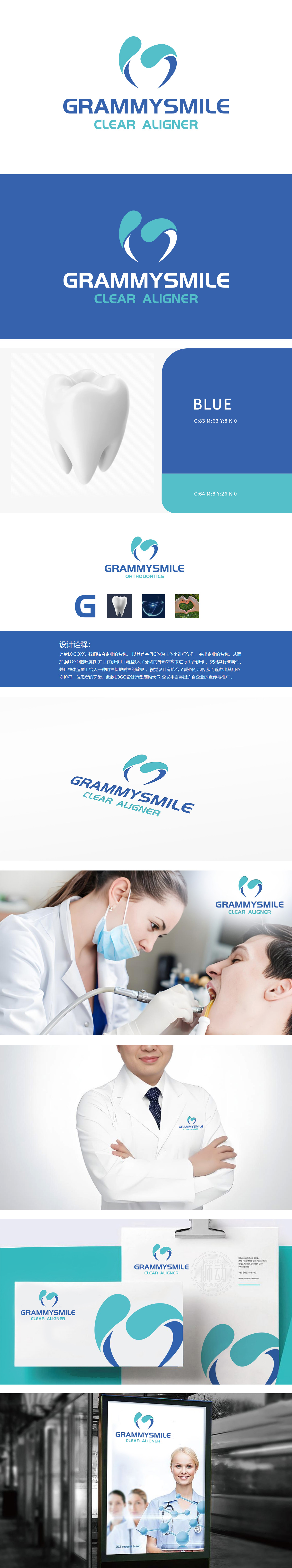
狮动设计以极简线条融合“G字母+牙齿+爱心”三重意象,既保证品牌识别度,又通过具象化的牙齿形态和情感化的爱心符号,快速传递“专业正畸+温暖服务”的双重价值,符合医疗服务行业“专业与温度并存”的需求强化“呵护、关爱”的服务理念,呼应设计诠释中“用心守护每一位患者牙齿”的核心主张。
Lion design combines the triple images of "G letter+teeth+love" with minimalist lines, which not only ensures the brand recognition, but also quickly conveys the dual values of "professional orthodontics+warm service" through the figurative tooth shape and emotional love symbols, which meets the demand of "professionalism and temperature coexist" in the medical service industry and strengthens the service concept of "care and care".


扫码或拨打添加客服微信


