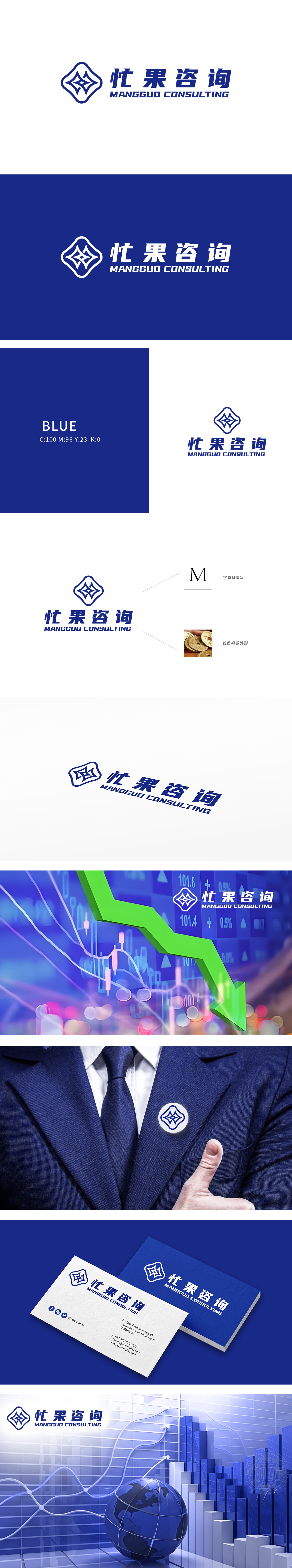
狮动为忙果咨询设计的品牌logo,以蓝色为主色调传递专业与信赖感。左侧不规则四边形,象征多元咨询服务的动态交织与持续创新;线条的简洁流畅性,则呼应忙果咨询高效精准的服务理念。右侧中英文品牌名称的布局强化了国际化定位。设计过程中,狮动团队深度调研行业特性与客户需求,将战略咨询的智慧沉淀与前瞻思维转化为视觉符号,显著提升了品牌辨识度与市场影响力。
The brand logo designed by Lion Sports for Busy Fruit Consulting conveys professionalism and trust with blue as the main color. The irregular quadrangle on the left symbolizes the dynamic interweaving and continuous innovation of diversified consulting services; The simplicity and fluency of lines echo the efficient and accurate service concept of Busy Fruit Consulting. The layout of Chinese and English brand names on the right strengthens the international positioning. During the design process, Lion Sports team deeply investigated the industry characteristics and customer need.


扫码或拨打添加客服微信


