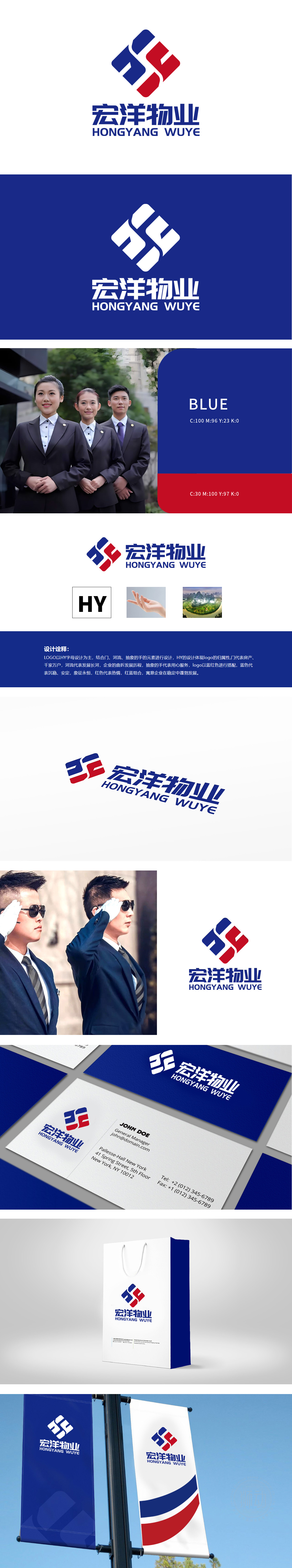
狮动设计采用“宏洋物业”首字母“HY”为设计核心,通过几何化处理形成菱形结构,既体现品牌专属标识性,又暗藏房地产物业行业特征:“门”元素:直接关联“房产”“千家万户”的居住属性,契合物业作为社区服务入口的角色。“抽象的手”直观传达“用心服务”的物业核心价值,体现对业主的关怀与托举责任;红蓝组合形成经典对比,通过冷暖平衡传递“在稳定中蓬勃发展”的企业定位,符合房地产物业行业“稳健运营+人文服务”的双重属性。
Lion Design takes the initial "HY" of "Hongyang Property" as the design core, and forms a diamond structure through geometric treatment, which not only reflects the brand's exclusive identity, but also hides the characteristics of the real estate industry;"Door" element: it is directly related to the residential attributes of "real estate" and "thousands of households", and fits the role of property as the entrance of community service. The "abstract hand" intuitively conveys the core value of "service with heart" and embodies the care and responsibility for the owners;


扫码或拨打添加客服微信


