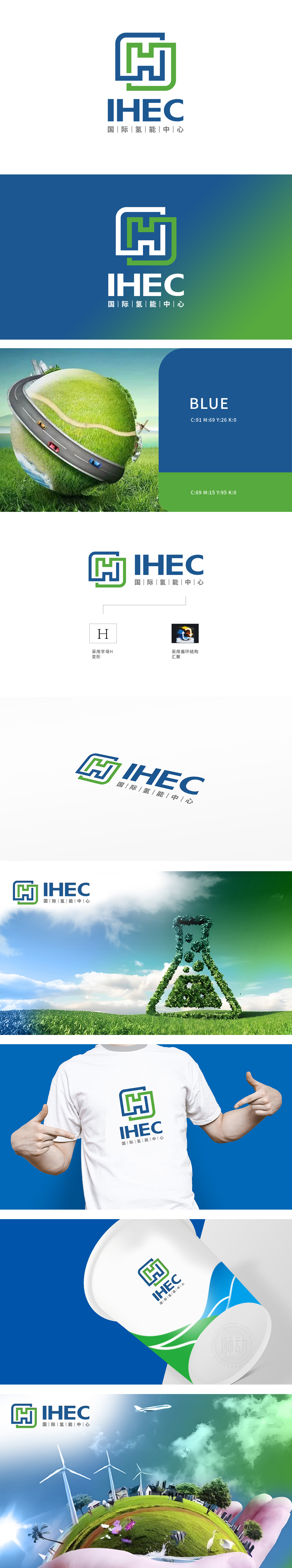
狮动设计以蓝色与绿色为主色调,通过几何线条勾勒出“回环交织”的字母“H”变形结构,直接呼应“氢”的首字母,明确指向氢能主题,与化工领域中清洁能源、绿色科技的属性高度契合。蓝绿色搭配既传递科技感,又象征环保与可持续发展,符合氢能作为零碳能源的行业定位。图形中“H”的回环线条不仅展现氢能产业链的闭环,也象征全球氢能资源、技术与合作的“汇聚”,呼应“国际”定位。整体图形对称且富有张力,线条简洁现代,既符合科技类品牌的视觉审美,又通过几何结构传递化工行业所需的严谨与系统性。
Lion design takes blue and green as the main colors, and outlines the distorted structure of the letter "H" interwoven by geometric lines, which directly echoes the initials of "hydrogen" and clearly points to the theme of hydrogen energy, which is highly consistent with the attributes of clean energy and green technology in the chemical field. Blue-green collocation not only conveys the sense of science and technology, but also symbolizes environmental protection and sustainable development, which conforms to the industry positioning of hydrogen energy as zero-carbon energy. The loop line of "H" in the graph not only shows the closed loop of the hydrogen energy industry chain.


扫码或拨打添加客服微信


